
Hey everyone! Welcome back. I am so glad to be back showcasing Winnie & Walter products. I have three cards for you today using tone on tone stamping technique. All three cards follow the same technique just different colours, different stamping layout and sentiment. So I will share all the three cards first and then explain how I made it.
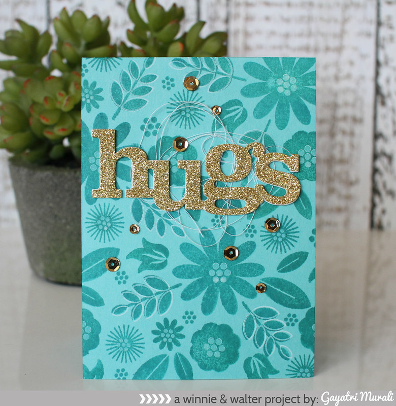
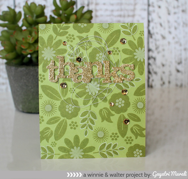
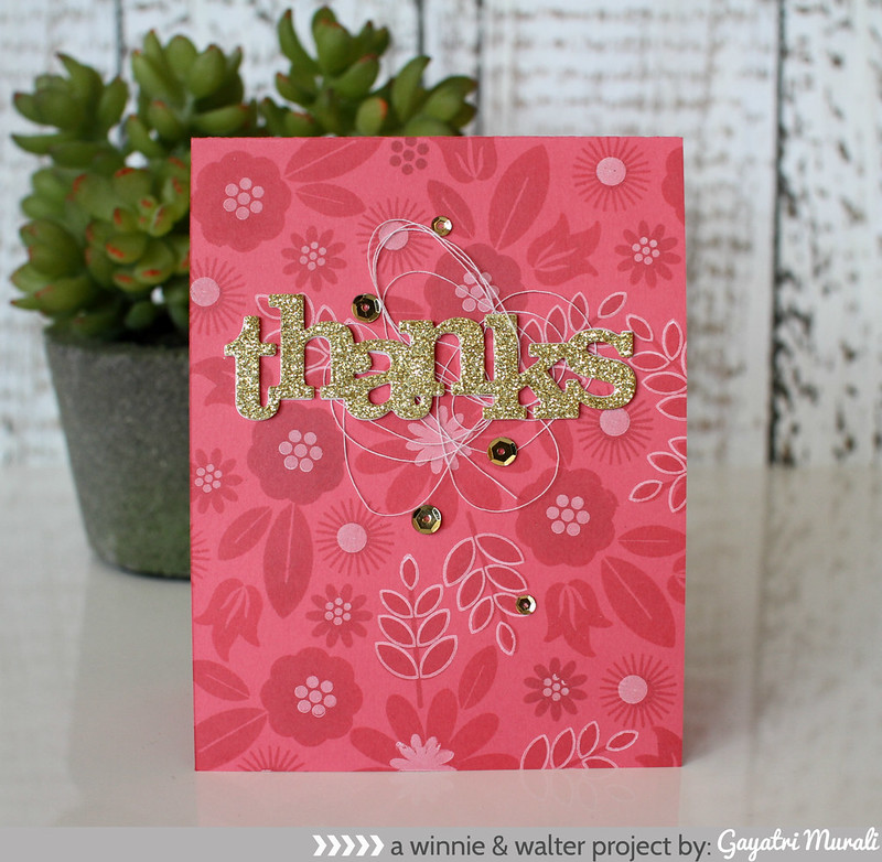
I picked three bright coloured cardstocks - red, green and blue. I made card base out of the three coloured cardstocks. Then I picked In Bloom: Eva's Favourite Flowers stamp set to stamp on the card fronts. I picked this stamp set because of the solid floral images in the set. Also the set also have outline images and layers for the florals as well. The outline and layer images will work well to add accents to the tone on tone stamping. So here is how I made these cards.
1. I picked the ink colours which were a bit darker shade to the coloured card base. I chose Lipstick Red, Jelly Bean and High Dive SSS inks. As you can see my High Dive ink is a bit dry and so it is blotchy on my blue card. You can overcome this by either choosing a good juicy ink or using MISTI to double stamp the image for even coverage. I chose to share the card to show these things happens to all of us.
2. After stamping the blue card front one stamp at a time with acrylic blocks and not getting good results, I switched to my MISTI. I clustered the images and stamped the green and red card front. Some of them were double stamped to get even coverage. Love the tone on tone stamping. Subtle and beautiful. I let them all dry.
3. Then I die cut the sentiments for the cards. I have used In a Word: Hugs and Thanks cutaways. I die cut them in gold glitter cardstock and a few using white cardstock to stack and glue them with the gold glitter die cut on top for added dimension.
4. I went back the card front to stamp the details on the flowers and leaves using white pigment ink. The white pigment ink is vibrant when stamped on top of the dye ink when dry. Otherwise the colour of the dye ink seeps through the white pigment ink making them a lighter shade of the dye ink. Love the white layering details on the card front.
5. I added some bunched up thread behind the die cut sentiment and adhered on the top centre of the card front.
6. Finally embellished with gold 6mm and 4mm sequins from Pretty Pink Posh.
This technique is simple and easy to mass produce. All you need is solid and detailed layering stamps on the set. So if you are starting you Christmas cards, this is one technique you can use. These are also almost one layer cards. No bulk and easy to mail. If you like to step it up, die cut the card front using one of the rectangle dies from Essentials cutaway and adhere on a card base using craft foam for dimension.
Here are the Winnie & Walter's products I used on my cards:
2. In a Word: Hugs
3. In a Word: Thanks
Hope you like my cards today. Thanks for stopping by today.


Gayatri I love them ... the green is my personal favorite 'flavor' =]
ReplyDelete=] Michele
These are so pretty, love the tone on tone!!
ReplyDeletethese are very pretty Gayatri. Love the tone on tone look
ReplyDeleteThe tone on tone is understated elegance... beautiful cards!
ReplyDeleteWhat beautiful cards!!
ReplyDeleteI can't wait to try my hand at a similar card!!! Each card is beautiful!!!
ReplyDelete