Showing posts with label in a word: hi cutaway. Show all posts

Thursday, May 10, 2018

Hi Friend Hello with Gayatri

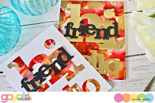
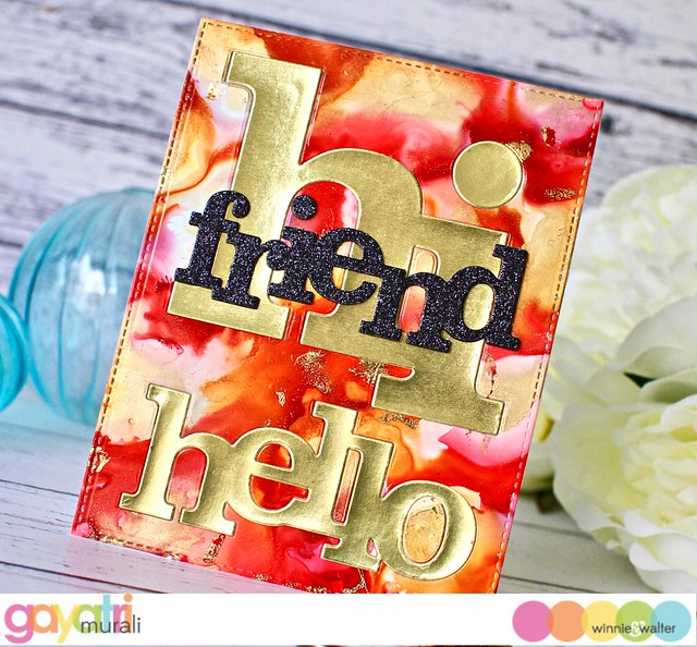
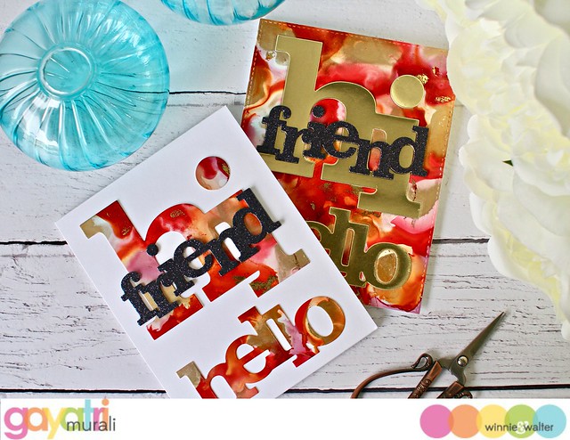
Today I have couple of cards using Winnie & Walter's cutaways(dies). I have stretched the cutaways to make two cards. Basically I used both the positives and negatives of the same cutaway to make two cards. The best way to stretch the cutaways is creating a background and die cutting the background using the cutaways. Use the negative of the die cut to make one card and the postive die cuts to make the other. For the background of my cards, I used alcohol inks and decor foil.

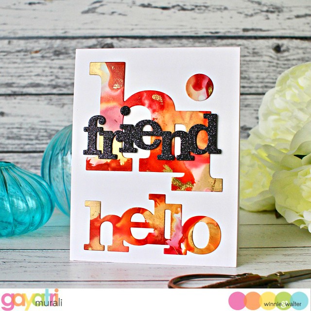
gayatri_W&W May cards#1

The alcohol ink colours I used are Watermelon, Pink Sherbet and Sunset Orange along with gold mixatives to make my background on Yupo paper. While still tacky, I used gold foil to rub on the panel. The foil will adhered to the tacky areas creating organic veins of gold foils on the panel. They are beautiful. Then I die cut the background using a stitched rectangle die to fit the card front.

gayatri_W&W May cards#1closeup

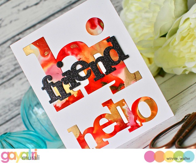
Then I used In a Word: Hi and Hello cutaway to die cut the background. I used the die cuts on a white card base adhering them one below the other to fill the card front. The contrast of white with the colourful die cuts are fantastic. To add to the contrast and add dimension, I die cut In a Word: Friend using black cardstock twice and black glitter paper once. I glued stacked the die cut with the black glitter on the top.  I adhered this on top of the Hi die cut on the card front. I am not adding any embellishments to the card because the contrasts and big bold colourful die cuts are the highlights of the card.

gayatri_W&W May cards#1d gayatri_W&W May cards#1ecloseup

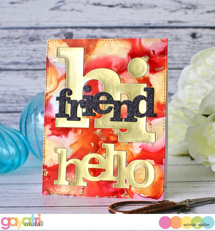
For my second card, I used the negative panel. I adhered this panel on the card card front flush. Then I die cut the same In a word: Hi and Hello using gold foil cardstock and in laid the die cuts into its place on the negative panel on the card front. I also put back the little fill in pieces.  I repeated the same process for In a Word: Friend cutaway and adhered in the same spot as the first card. So the layout on both the cards are the same.

gayatri_W&W May cards#1c gayatri_W&W May cards#1bcloseup

So here is how I used the same dies to stretch and make two cards. The colourful mesmerising alcohol backgrounds makes a big impact. I hope you like my projects for today. All the w&w supplies used to make this card are listed below.

Thanks for stopping by today.

My blog signature

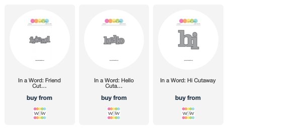
w&w-supplies

Monday, February 19, 2018

w&w 4th Birthday Bash | Special Guest Star Amy Kolling

amykolling


We kick off posts the next week and half from special guest stars with the wonderfully talented and kind, Amy Kolling!  I have had the real honor and pleasure of spending time with Amy and she is such a warm, caring and giving person.  I am so delighted to have Amy taking over the w&w blog today.  Please give Amy a big w&w welcome!

Hi everyone!  I am so excited to be posting here today on the blog as a special guest star for Winnie & Walter during their 4th Birthday Bash!

I have a TWO cards to share where I incorporated some of the Birthday Bash challenges that are going on this month.  

amy_HappyBirthday

My first card uses the “Shaker Challenge”.  I started by creating my own plaid background using the Scenery: V for cheVron.  This was made easy by using my standard Misti tool.  Once my background was stamped, I diecut a standard circle from the middle for my shaker.  

For the focal point, I used the Happy Birthday to You stamps and coordinating Happy Birthday to You Cutaways.  The various elements were added with foam adhesive.  I layered the birthday cake over the shaker center and added sequins.

amy_HappyBirthday2

**************

amy_Hi

My second card goes clean and simple and uses the “Four Challenge”.  I used the Scenery: Triangled Creative Screening and ink blended in an ombré fashion.  With this panel, I die cut the In a Word: Hi Cutaway.  Also using this Hi Cutaway, I die cut 3 layers of black cardstock.  Layering them all together, I added them back in the negative space with foam adhesive.  

amy_Hi2

Make sure to check out all the challenges because they are still open to have some fun!  Enjoy the rest of the Birthday Bash and Happy Birthday Winnie & Walter!


w&w-supplies

Friday, April 7, 2017

The Gossip Column with Taheerah Atchia | No.7 - Alan Kitching

BREAKING NEWS:

BLOGLAND, Apr 7 (w&w HQ) - Setting and locking down on a renowned artist, critically acclaimed trend-reporting feature, The Gossip Column, minds its Ps and Qs in its exposé of a much-lauded, re-emerging trend, and its suffusing influence in the papercrafting industry.

---------------------------------------------

Hi there everyone, and welcome back to another issue of The Gossip Column!! I know many of you have been awaiting the next instalment with baited breath, so I'm delighted to bring you your latest gossip fix, hot off the press! This month's issue is destined to dazzle, with a focus on one of the hottest trends, not only of the moment, but also of enduring appeal!!

If you're either new to The Gossip Column, or would like a refresher about it, please feel free to digest the most recent article, or keep reading for a quick recap of what The Gossip Column is all about:


The Gossip Column is an exciting regular feature, with trend reporting and challenge and giveaway all rolled into one! Heading up this feature is our columnist Taheerah Atchia!

With each issue, Taheerah brings you an article, hot off the press, featuring a trend of some sort. Her write-up could feature trends reported from anywhere, not just papercrafting! As a part of the article Taheerah will also bring you some projects which interpret the chosen trend into papercrafting in some way - before throwing down the gauntlet for you to do the same! This exciting take on a challenge will still bring you the chance to create projects featuring your favourite w&w goodies, and the chance to win prizes too! But, more on that later!

Without further ado, let's dive straight into the seventh issue of The Gossip Column! We'll now hand you over to our Gossip Columnist, Taheerah!


We are living in the Digital Golden Age of Man. Never in our history as a species have we seen such a period of technological accomplishment, with connectivity on such a global scale. We can speak to someone on the other side of the world at an instant, and can even see their faces as we do so. We are able to be connected to people in ways we had probably never imagined coming into contact with. Technology weaves us all together. And yet, it's not uncommon to feel disconnected from others.

Whilst our wonderful golden age has brought us closer together in a digital sense, we have been slowly losing something of the essence that connects us on a visceral level. Communications can lack that sense of authenticity that comes with committing ink to paper, that deliberateness of movement, of function, of purpose.

It's therefore perhaps of no surprise that one perceived 'dead' form of printing is enjoying something of a renaissance: letterpress. Going far beyond the tactile nature of being able to feel the impression of the words; the very considered, deliberate action of committing those words, one character at a time, to be immortalised in print, is one of thought, of purpose, of connection. A compositor (one who physically composes movable type) moves with deliberate precision, carefully arranging each piece of type (or 'sort') in its rightful place, tamping down the arrangement in a process known as imposing, proofing the design on paper, before finally printing the work; the entire process an act of finesse not unknown to artists.[1]

Letterpress is a form of relief printing, whereby metal or wood type is used to impress ink into a surface with the aid of a press. The raised surface of the type is inked by hand or mechanically by the press. Gutenberg is often credited with having invented his own press in the mid-15th Century. It was the first method of printing multiple copies of text, and as such quickly found commercial use in journalism and publishing. It continued to be the dominant form of printing until around the 80s, when computer printing took its place. Today, very few printing houses utilise letterpress for commercial printing - though that is changing thanks to renewed interest in this process.

There are of course many artists in this arena now that letterpress is enjoying its second life as an artform rather than necessary printing process - but in this writer's humble opinion, there is one legend whose work stands head and shoulders above the rest - Alan Kitching.[2]

Alan Kitching, Typographic Artist

British-born Kitching (1940-) grew up in Darlington, County Durham - an industry-dominated railway town. He developed an interest in printing, drawing, and painting while at school (his early forays into typsetting were setting and printing carol sheets under the tutelage of his art teacher). His ambitions of working as a poster artist at odds with his local surroundings[3],[4], he learned of an apprenticeship at a local jobbing printer - and his six year stint as a compositor set his career on a trajectory that would see him change the face of typographic design in later years.

Poster designed for Central School of Art And Design, 1969

Kitching's apprenticeship concluded in 1961, having already been influenced by the works of Jan Tschichold from his exposure to publications such as the Printing Review and British Printer. However, it wasn't until his work as a technician at the Watford College of Technology, where he worked with graphic designer Anthony Froshaug, that his love affair with typography really began.

Work by Jan Tschichold - an early influence

Post 1950's Graphic Design History Poster by Anthony Froshaug
 - a heavy influence on Kitching's style

Froshaug quickly realised Alan's aptitude and the two established a productive working relationship. When the opportunity arose for an experimental Type Workshop to be established at the College, Forshaug and Kitching became the perfect partnership, with Kitching's work gaining accolades and being exhibited at the Institute of Contemporary Art. Kitching finally had a taste of the recognition his work demanded, and his career went from strength to strength. By the early 70s he was ready to fly solo and opened his own design studio.

Commissioned work for AOL, showcasing Kitching's signature brushed roller texture

An illustrious string of freelance jobs saw Alan create for a slew of clients, including The Guardian, AOL, The British Library, Penguin Books, The National Theatre, Royal Mail, and many more.[5],[6]

Amis on Porn - first job for The Guardian

Fast forward to today, and Alan Kitching's name is synonymous with letterpress and typography. He works and lives in his studio in Kennington, London - a former alehouse made into eclectic home[7], where he combines teaching a small but focused workshop on letterpress printing, his own work, and simple living. He is owner of what may be the largest collection of wood type in the world - all of which still find purpose in his designs. His work has been exhibited worldwide, and his bold style has left an iconic mark on the letterpress landscape. In short, his work has an indelible appeal that is perhaps surpassed only by the medium itself with which he works.

So what did Alan Kitching do that seals his place in history? His expressive use of wood and metal letterforms perfectly marries art with typography - one of the earliest artists to do so, and a trend we see continue today in graphic design and art. His bold strokes of ink convey the mood of the words they imprint, suffusing emotion with colour. His work is instantly recognisable, from the large scale poster works for theatres, to the humble postage stamp. Like all great artists, his work holds a mirror up to the time in which it was created. His influence on the next generation of artists and designers is certain.

Here are just some of my favourites... 


I strongly encourage you to view yet more samples of Alan Kitching's work via a Google image or Pinterest search - you won't be disappointed!

From cutting his own large scale type from board, to composing energetic, exuberant masterpieces. Political statements of resistance, to emotive representation of poetry. Iconic advertising, to commemorative pieces. Textural. Raw. Bold. Alan Kitching's work could never be accused of being out of sorts. In fact, it's perfectly pixel-imperfect.


So, with my head absolutely buzzing with that heady cocktail of inspiration, I couldn't wait to apply the look of Kitching's work to my own creations!

My first card went for a full look based on one of Alan Kitching's prints:


I used the letters from the Typecast: Cary set to fill my card. I started with the main sentiment, stamping it in Versafine, and then used Distress Inks for all my red stamping - it was so fun having to not worry about getting a solid impression, as that's actually the look I was seeking to emulate!


I used some of the smaller sentiments from The Big, the Bold, and Party to fill in some of the smaller spaces, and compliment the birthday theme!

My second project embraced white space and inking for a different look:


I used the In A Word: Hi Cutaway die to die cut the word from some fun foam, sprayed the top with repositionable spray adhesive then mounted it on an acrylic block to use it as a stamp! I love that I was able to create a stamp from this die!


Once again I turned to Distress Inks to create that perfectly imperfect inked finish - inking the colours on top of each other to create overlapping hues! Such a fun look!

And for my final card, I went with a little bit of everything:


Once again I die cut the In A Word: Hi Cutaway from some fun foam, but this time I separated the 'h' and 'i' using my scissors so that I only had the 'i'!


Some mixed pinks, a few letters from Typecast - Cary, and a supporting sentiment from The Big, the Bold and the Happy finished everything nicely!


So, now that you've had a brief history of letterpress and Alan Kitching and his style, a host of inspiration images*, and some of my own creations to further inspire you, I am delighted to bring you this month's Gossip Column challenge!

Your challenge is to create a project which uses the look of letterpress/typography in a creative way! Use dies, stamps, a clever technique, whatever - the choice is yours! As always I like to stretch your creativity, so I'm asking you to think outside the box with your designs and push your use of the theme outside your comfort zone! Pick a style that's new to you, or use your supplies in a different way, try a new technique, combine with one or more other trends - wherever your creativity takes you! I will be looking closely for originality as well as execution when it comes to picking winners, so dare to be different and show me what you can do!

*Need more inspiration? Check out our Pinterest board for a plethora of pins to further spark your creativity!


The Rules
  • Create a brand new project which uses the look of letterpress/typography as a part of your design
  • Post on your blog or to an online photo album. Ensure you link up to this challenge post in your blog post
  • Extra credit will be considered for projects which use Alan Kitching's work as inspiration for your design, embracing a new-to-you technique, and/or for a creative and original use of typography in your design
  • You may still use images in your designs, but the focal point of your design should be the typography
  • You must use at least one Winnie & Walter product for your creation. This can include our free digital products too!
  • Link up your creations to this post using the Inlinkz below. Please use the link to your actual post rather than the link to your blog
  • You can enter as many times as you like!
  • The deadline for linking submissions is Wednesday 31st May at 11:55pm CST. 
  • I will select one overall winner ('Gossip Queen/King'!) and two honourable mentions ('Hot Gossips'!). The Gossip Queen/King will win $30 credit to the w&w shop, and the Hot Gossips winning a $15 credit a piece!
  • Winners will be announced on Wednesday 7th June.

Are you ready to put your gossiping skills to the test?! I can't wait to see your creations!!


Just one more thing before you go! We would love your feedback on The Gossip Column and the challenge, so please do leave us a comment on this post! Each and every issue of The Gossip Column will focus on something different and we can't wait to bring you the future issues if you love this feature!

'Til next time, Gossipers... !

Taheerah

---------------------------------------------
Further Reading:


Friday, January 6, 2017

The Gossip Column with Taheerah Atchia | No.6 - Marble

BREAKING NEWS:

BLOGLAND, Jan 6 (w&w HQ) - Ringing in the New Year and with it the possibilities for many daring exposés, critically acclaimed trend-reporting feature, The Gossip Column, returns with a rock-solid exclusive of its latest, celebrated trend in the papercrafting industry.

---------------------------------------------

Hi there everyone, and welcome back to another issue of The Gossip Column!! I know many of you have been awaiting the next instalment with baited breath, so I'm delighted to bring you your latest gossip fix, hot off the press! This month's issue is destined to dazzle, with a focus on one of the hottest trends, not only of the moment, but also of enduring appeal!!

If you're either new to The Gossip Column, or would like a refresher about it, please feel free to digest the most recent article, or keep reading for a quick recap of what The Gossip Column is all about:


The Gossip Column is an exciting monthly feature, with trend reporting and challenge and giveaway all rolled into one! Heading up this feature is our columnist Taheerah Atchia!

Each month, Taheerah will bring you an article, hot off the press, featuring a trend of some sort. Her write-up could feature trends reported from anywhere, not just papercrafting! As a part of the article Taheerah will also bring you some projects which interpret the chosen trend into papercrafting in some way - before throwing down the gauntlet for you to do the same! This exciting take on a challenge will still bring you the chance to create projects featuring your favourite w&w goodies, and the chance to win prizes too! But, more on that later!

Without further ado, let's dive straight into the sixth issue of The Gossip Column! We'll now hand you over to our Gossip Columnist, Taheerah!


Opulent. Lavish. Majestic. Throughout the ages, many of the most iconic pieces of art and architecture have featured one material in particular for its marriage of beauty and endurance.

Marble.

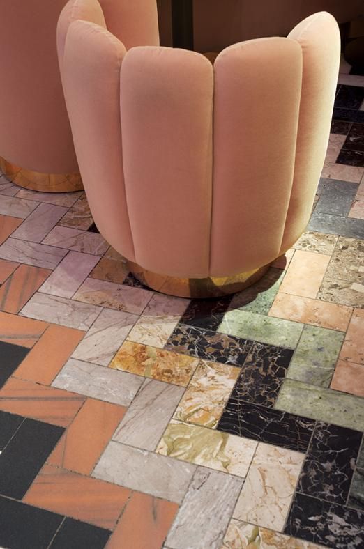
Marble is a red-hot trend emerging in papercrafting at the moment - but as with most trends it has already trod the boards in other forms, playing its own small part in a much larger Dance of The Trends (a coined Taheerahism). Our love affair with marble, one of the most beautiful of rocks, is one that spans centuries. Long before we were picking it out for our bathroom tiles, marble was gracing the floors of palaces, the façades of buildings, the hands of sculptors. From the purest white with delicate veining, to the most dramatic of colours with the most vibrant of patterns, marble instantly conveys a message of wealth and prestige. Differences in colour and veining in marble can be traced to particular locations around the globe - and so the use of exotic marble in Roman buildings, for example, was a dramatic statement of the power and reach of the Roman Empire.[1],[2]


A Roman table top inlaid with large variety of ornamental marble excavated from tombs on Appian Way, a road constructed from Rome to Capua by Appius Claudius Caecus in 312 BC

Relief from the Ara Pacis Augustae (Altar of Augustan Peace), 9 B.C.E. Much of Roman art was heavily influenced by its Ancient Greek equivalents

The History of Art, Greek and in particular Roman, is of great interest to this editor (and one she indeed studied) - but although these impressive works are worthy of an article all their own, let us journey even further back, to the origins of marble itself.

Molten rock (magma) from a volcanic eruption

Casting your memory back to high school geology, you might recall that there are three types of rock: Igneous, Sedimentary and Metamorphic. The three types of rock are intimately locked in a continuous cycle of formation known as the Rock Cycle.

The Rock Cycle

Igneous rocks are formed by the melting and cooling of magma, and can form below the surface of the Earth, surrounded by other rock (intrusive) or above the surface (extrusive). The amount of grain in the rock depends on where it was formed - intrusive igneous rocks have a coarse grain as they cool slowly within the Earth's crust, whereas extrusive rocks have a fine grain as they cool quickly when they are brought to the Earth's surface following a volcanic eruption.

Diorite - an example of an Igneous rock

Sedimentary rocks are formed by the deposition and cementation of deposits at the Earth's surface, and within bodies of water. The particles, or sediment, which form sedimentary rock, are formed by the weathering of rock formations at the surface. There are several different classifications, depending on what the main sediment is that forms the rock.

Dolomite - an example of a Sedimentary rock

Metamorphic rocks are formed by transformation of other rock types, by subjecting them to heat, pressure, chemical processes, or a combination of these. These extreme conditions alter the mineralogy, texture and chemical composition of the rock. Metamorphic rocks may have a banded ('foliated') appearance[3], which is produced by exposure to heat and directed pressure.

Marble[4] is a Metamorphic rock (sometimes foliated, though normally non-foliated), typically formed from the parent rock of Calcite (limestone) or Dolomite.

Marble - an example of a Metamorphic rock

Pure marble is formed from the purest of Calcium Carbonate, and as such is pure white and has very little, pale, veining. The veining in marble is formed by the presence of impurities in the rock, such as clay, silt, iron oxides, sand or chert, and the various colours of marble occur as a result of being formed from different various types impurities the parent rock contains.

Although we typically attribute marble as being used in art and architecture, its properties lend it to many other uses too. Marble is actually a relatively soft rock (softer than granite), which allows it to be easily sliced into blocks and carved into sculptures - but its softness also means it is easy to crush. Crushed marble can be found in many other products, from calcium feed supplements to Alka-Seltzer[5]. It even finds uses in the Cosmetic and Pharmaceutical industries.

You'll never look at Michelangelo's David the same way again.


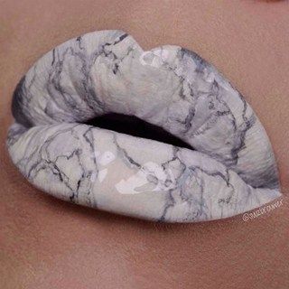
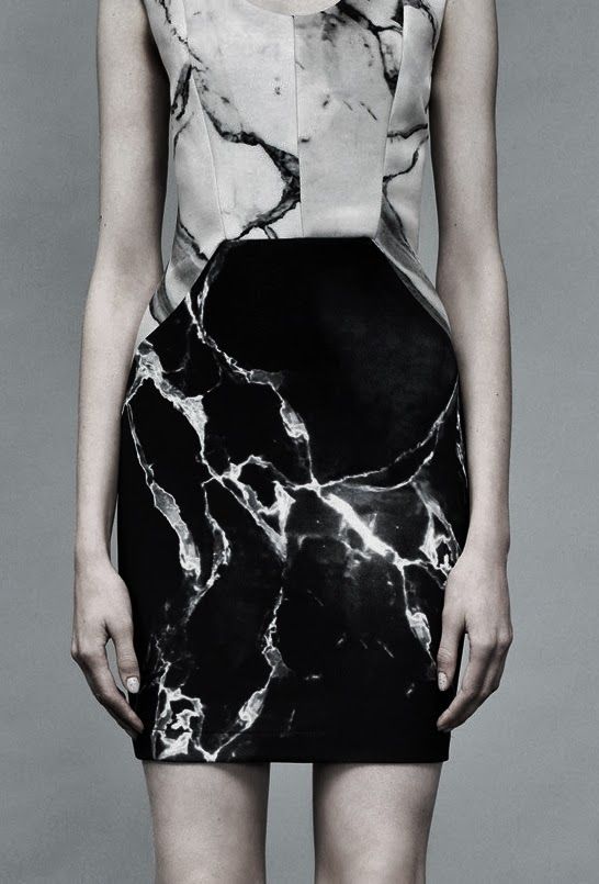
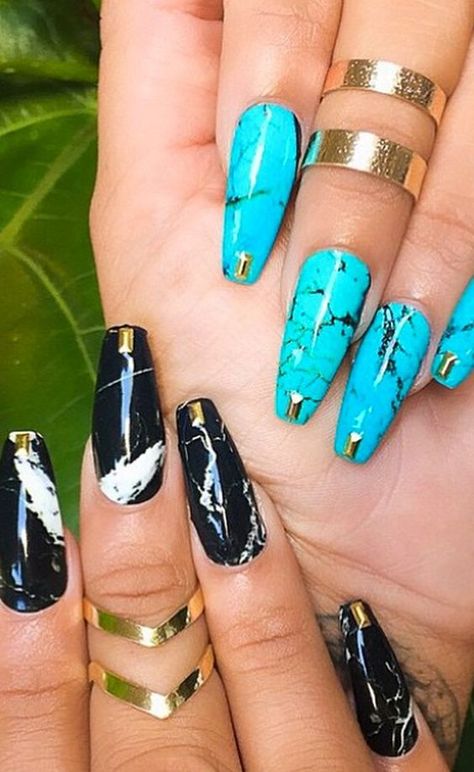
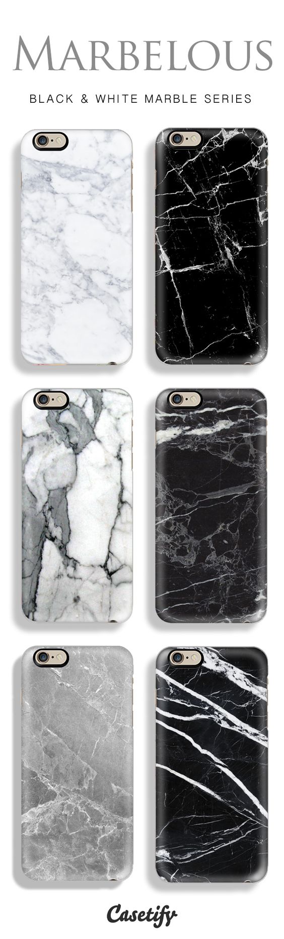
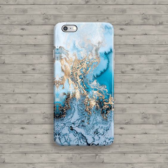
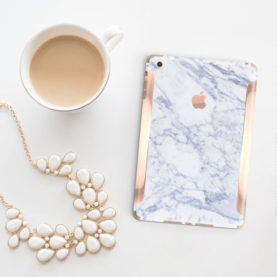
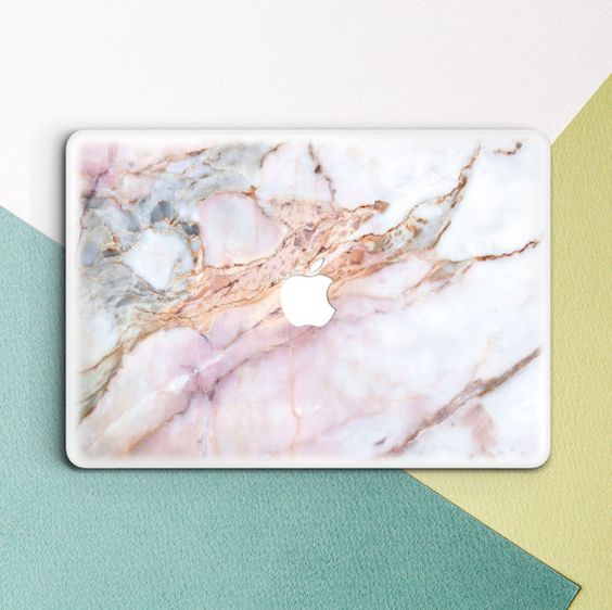
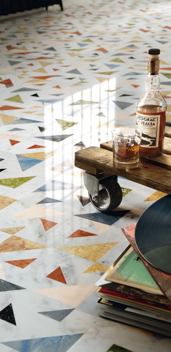
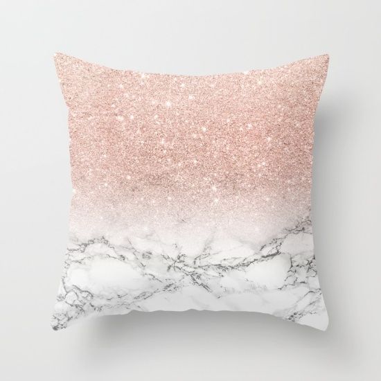
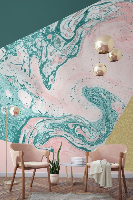
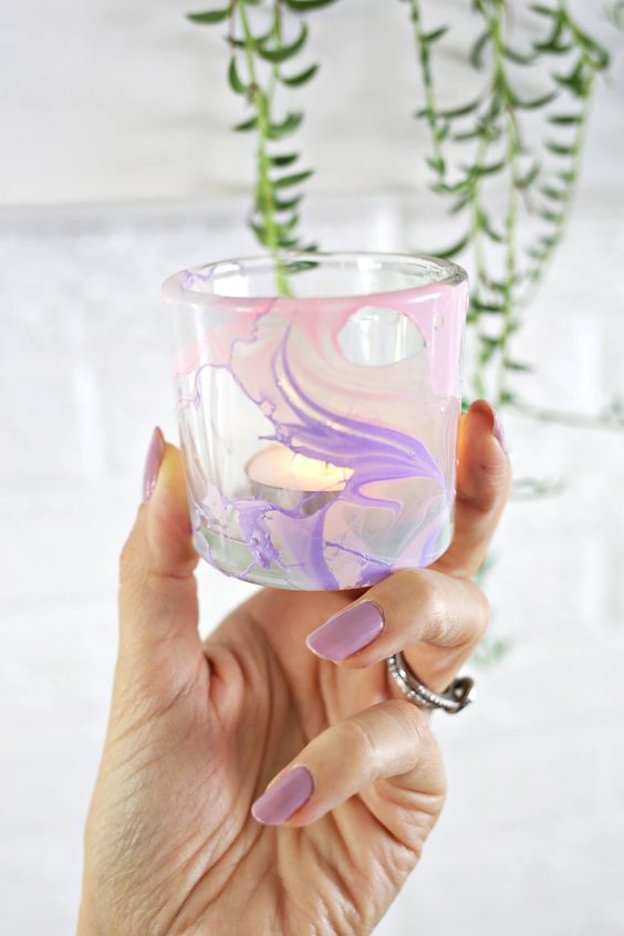
Returning to the present, and the Dance of The Trends, marble is back with a vengeance. It has actually been re-emerging as a trend for a few years now, gaining popularity in interior design, home décor and art and design, with fashion and other industries following suit. With digital media making it easier than ever to mimic a range of colours and appearances, graphic and web design are lapping up the lavish look. Marbling of surfaces (to give the appearance of a veined and/or marbled look) is also making a return, with papers, nails and other materials all receiving an array of treatments. From the quiet yet elusive beauty of a purer marble, to the dizzying, almost psychedelic medley of colours, marbling boasts a variety of looks that are as almost as versatile as the namesake they aim to evoke. 

Here come the pretty pictures... 

Fashion...


Technology...


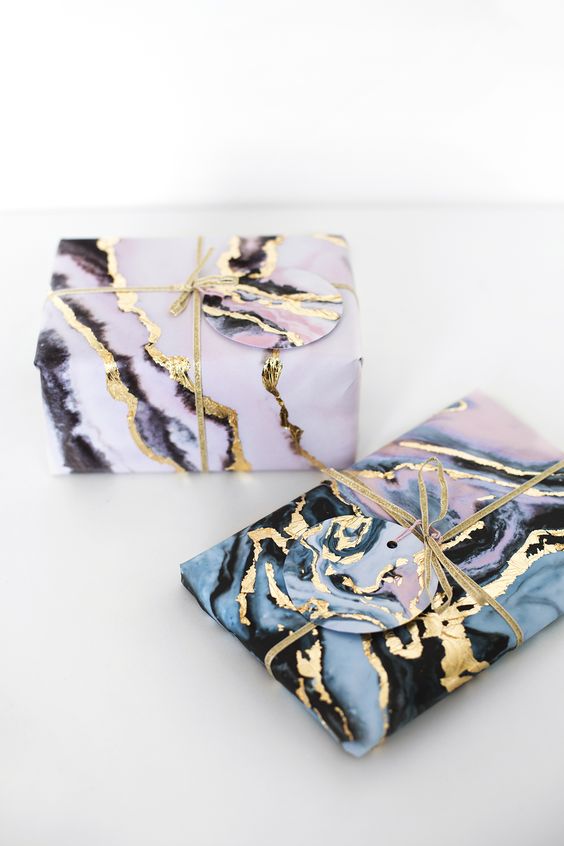
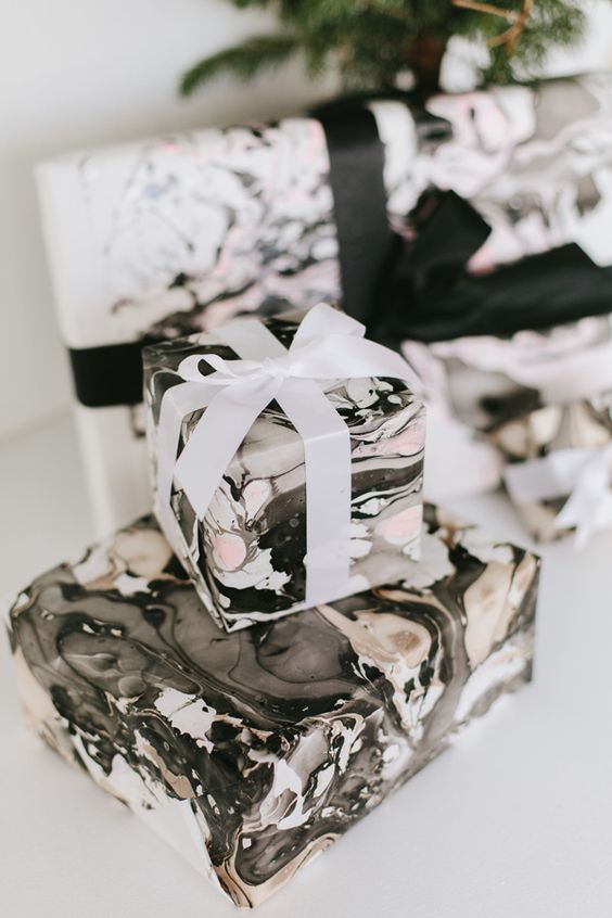
Homeware and décor...


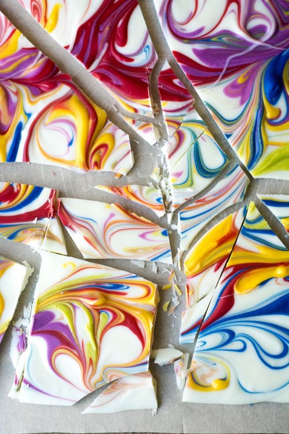
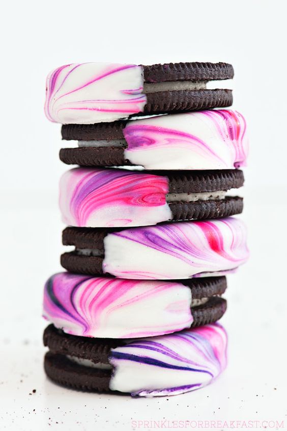
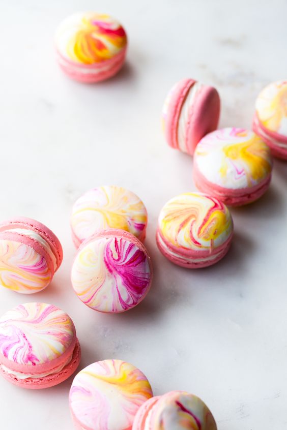
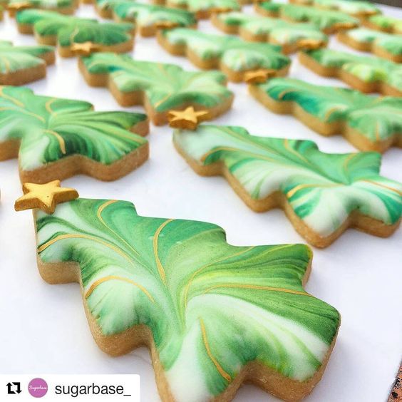
Food...


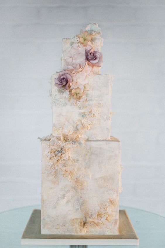
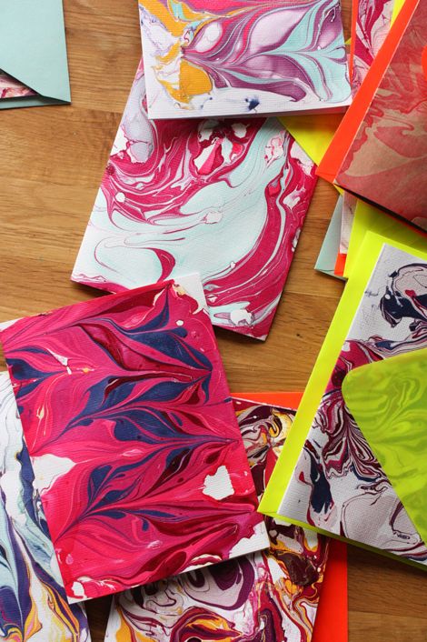
Art and Design ...


From edible, to extravagant, to elegant - the vibrance, variety and vivacity of marble invoke a sense of grandeur, wealth, style and taste. With a myriad of ways to incorporate a marbled look in everyday life, it is becoming easier and more enticing to bring back this ennobled rock and give it a new lease of life. In the grand circle of the Dance of The Trends, marble may still be able to send them all back to school.


So, with that near overload of the senses from all that inspiration, I couldn't wait to apply the look to my own creations!

My first card kept it simple and feminine:


I used some marble patterned paper and added a torn piece of my own handmade glitter paper! I wanted to show that marble can be ultra-feminine as well as masculine or chic, and the heart die from the True Multifaceted Heart Cutaways, die cut from pale gold glitter paper, finishes the look perfectly!


Look at that sparkly glitterness!


I couldn't help but give you a close-up!

My second project turned to stamping some marble:


The Mini Scenery: Marbleize stamp is perfect for creating the look of marbled paper! I inked it up a few times with different colours of Distress Ink, Distress Stain and gold mist, to create a more realistic finish!


I die cut the finished piece using the large tag from the Essentials: Katharine Cutaways, then  I stamped and heat embossed the heart from the True stamp set. As a finishing touch I die cut the 'love' and 'you' words from The Big, the Bold and the Happy Cutaways and The Big, the Bold and You Cutaways, adhering them together in strategic places to create a swinging multi-word tag charm!


And another close-up! Sorry, but these details need to be seen!

For my next card I decided to try my hand at watercolouring some marble:


I watercoloured my panel using Distress Inks, adding some of the finer filaments/veins using the wavy line stamp from the In Bloom: Anna's Flora stamp set!


I added pieces of woodgrain and plain white cardstock over the panel, then added the large stamped banner from the Framed with Evelin T Designs set.


My sentiment comprises of the the die cut In A Word: Shine Script Cutaway, heat embossing the word with some sparkly copper embossing powder, and some label maker sentiments. Love the bold graphic look of this one!

For my grand finale, I decided to embrace a new-to-me technique and created my own marbled papers using nail polish!


I created a whole array of different papers using the technique, and after they were dry decided to combine a few. I really wanted the marble to be the star of the show, so the In a Word: Hi Cutaway allowed me to finish each card off without stealing the limelight!

I still mixed up the finishes though - inlaid die cuts on this card:


With a close-up!


Stacked die cuts on this card:


And a close-up!


And a plain, shimmery die cut, adhered with dimension, on my final card:


With a stunning close-up!


This technique is addictive and really, really fun! I can't wait to make more!


So, now that you've had a whirlwind tour of all things marble, a host of inspiration images*, and some of my own creations to further inspire you, I am delighted to bring you this month's Gossip Column challenge!

Your challenge is to create a project which uses the look of marble in a creative way! Use patterned paper, stamps, a clever technique, whatever - the choice is yours! As always I like to stretch your creativity, so I'm asking you to think outside the box with your designs and push your use of the theme outside your comfort zone! Pick a style that's new to you, or use your supplies in a different way, try a new technique, combine with one or more other trends - wherever your creativity takes you! I will be looking closely for originality as well as execution when it comes to picking winners, so dare to be different and show me what you can do!

*Need more inspiration? Check out our Pinterest board for a plethora of pins to further spark your creativity!


The Rules
  • Create a brand new project which uses the look of marble as a part of your design
  • Post on your blog or to an online photo album. Ensure you link up to this challenge post in your blog post
  • Extra credit will be considered for projects which use marble as the main focus of your design, embracing a new-to-you technique, and/or for a creative and original use of marble in your design
  • You must use at least one Winnie & Walter product for your creation. This can include our free digital products too!
  • Link up your creations to this post using the Inlinkz below. Please use the link to your actual post rather than the link to your blog
  • You can enter as many times as you like!
  • The deadline for linking submissions is Tuesday 28th February at 11:55pm CST. 
  • I will select one overall winner ('Gossip Queen/King'!) and two honourable mentions ('Hot Gossips'!). The Gossip Queen/King will win $30 credit to the w&w shop, and the Hot Gossips winning a $15 credit a piece!
  • Winners will be announced on Wednesday 7th March.

Are you ready to put your gossiping skills to the test?! I can't wait to see your creations!!


Just one more thing before you go! We would love your feedback on The Gossip Column and the challenge, so please do leave us a comment on this post! Each and every issue of The Gossip Column will focus on something different and we can't wait to bring you the future issues if you love this feature!

'Til next time, Gossipers... !

Taheerah

---------------------------------------------
Further Reading: