Saturday, August 20, 2016

August Leading Lady Nina-Marie Trapani | Take Three

Our August Leading Lady, Nina-Marie Trapani, is back for is back for her triumphant third performance!  If you missed her smashing debut you must see it...CLICK HERE or her sensational second performance adding a personal touch and artistic flair CLICK HERE. Nina-Marie
 shows her mastery of design principles today with a showstopper of a card!

Without further ado, Nina-Marie....

Hello friends! Welcome back to my third guest post for Winnie and Walter's Leading Lady feature... I hope you are having as much fun as I have so far! :)
  Nina-Marie_Trapani_august2016 
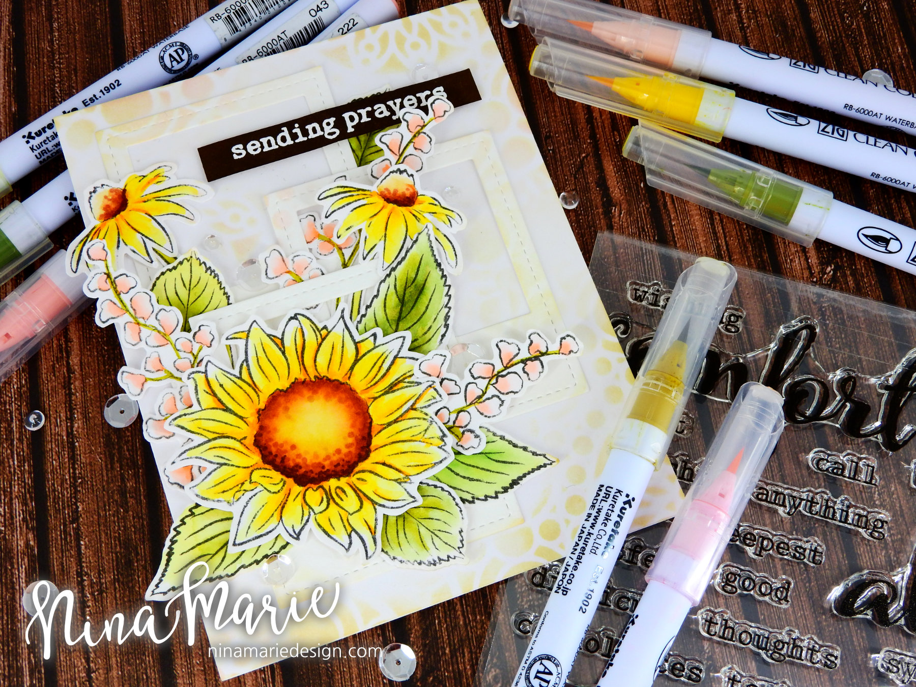
Today I want to share some inspiration on creating appealing card layouts using Winnie and Walter's In Bloom: Addie's Garden and In Bloom: Anna's Flora stamp sets. The reason I chose these floral images for today's card is because floral images are a great example of building a good layout; a poorly arranged flower bouquet isn't as pretty as one that was more thought-out. These floral stamps are some of my most favorite because of the beautiful detail and larger size of the images. This allows you to get creative with your coloring, which is so much fun! For this card I used a combination of Zig Clean Color markers and Copics to color the flowers and leaves.

  Creating Floral Arrangements_2

When building a good floral arrangement, I like to make sure I build with a few things in mind:

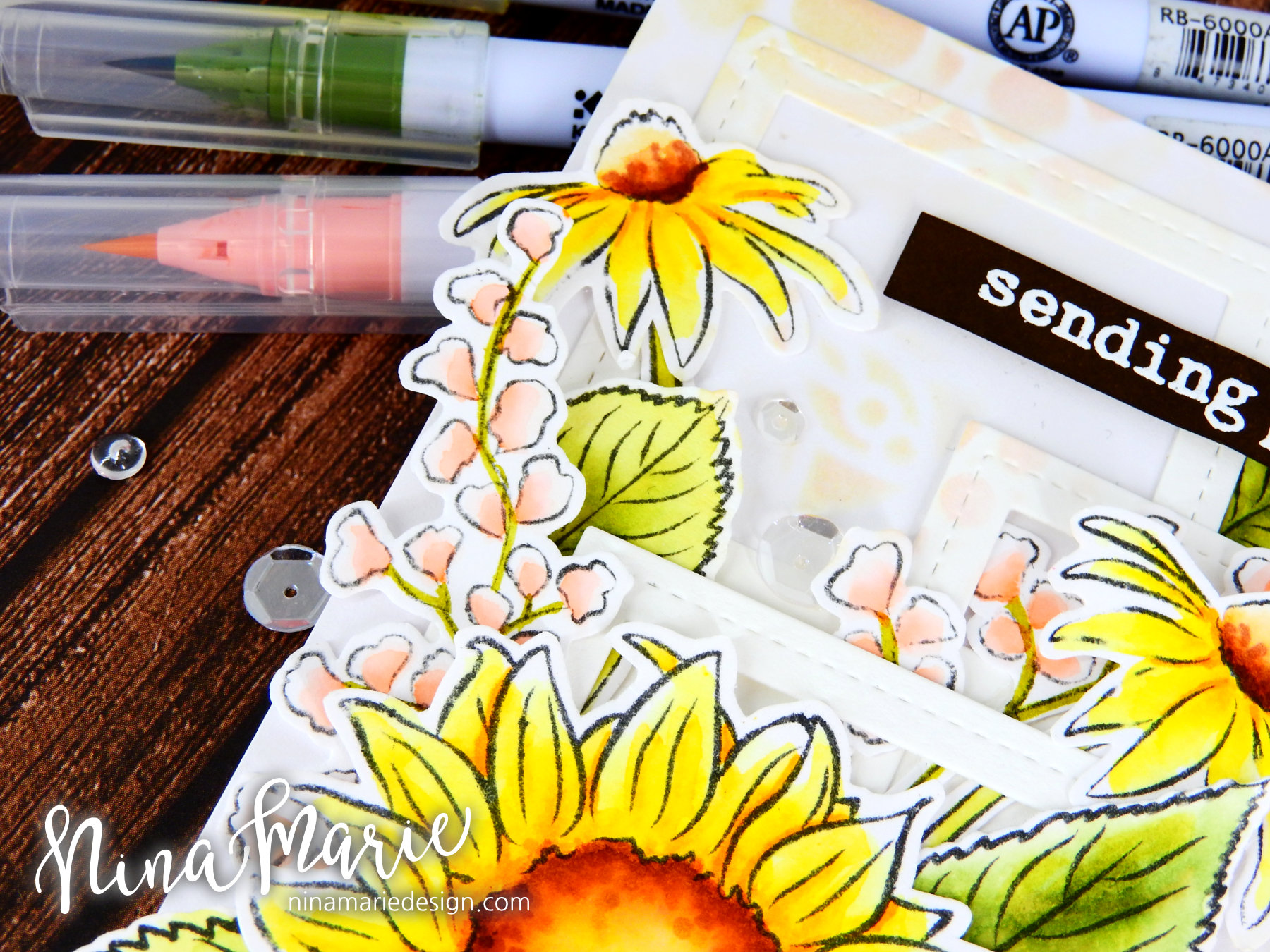
Rule of thirds: It helps to balance a design when there are three elements grouped into your card. For instance; I maintained this rule by using three frames in the background, three daisies, and three pink floral clusters. The odd number sits better in your mind believe it or not!
  Creating Floral Arrangements_5

Visual triangle: See how all of the major elements on this card all can be connected by a visual triangle (imagine overlaying a triangle to connect like objects together)? This helps draw attention to the more prominent elements and allows them to take center stage while still maintaining a good balance. Examples of the visual triangle are the layout of the frames in the background as well as the placement of the daisies and the pink clusters.

  Creating Floral Arrangements_1

Balancing Large and/or Bold Objects: This card features two heavy (large/bold) objects; the largest daisy and the strong colors of the sentiment strip. These two items can be balanced out on the design by placing them at polar opposites. In this case, I attached the daisy at the bottom left and the sentiment along the top right of the card. By placing them apart from each other, rather than close together, this helps keep the design from being too heavy in one area.
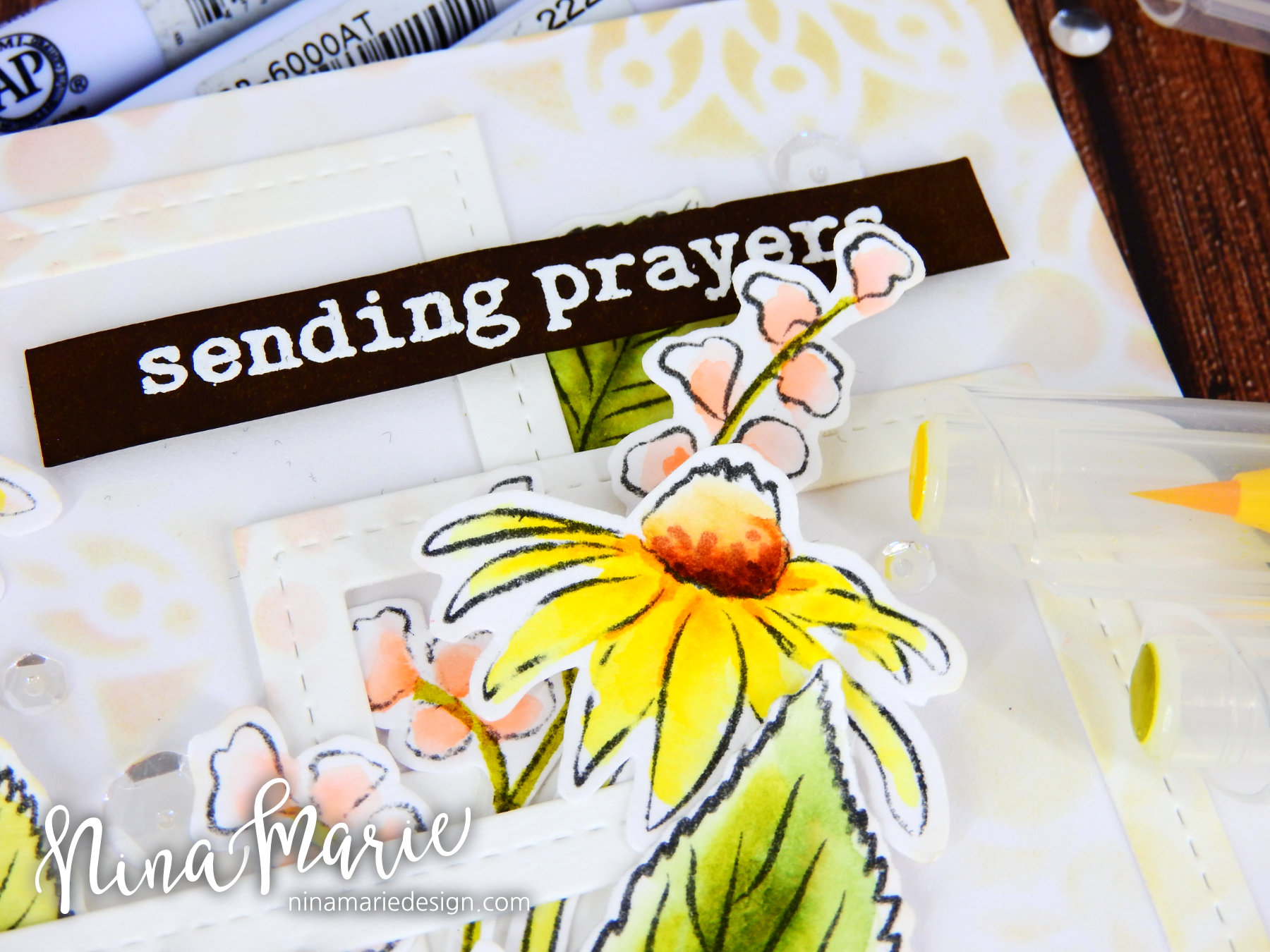
  Creating Floral Arrangements_6

Odd Numbers: Remember the rule of thirds and how odd numbers helps the design of the card sit better in your head? Well the same applies for numbers greater than three! I scattered a total of 7 clear sequins around the floral arrangement, as well as having a total of 13 larger elements on the card (12 floral elements and 1 sentiment strip). Having that odd number really ensures a good layout! 

Mixed Sizes: You'll also notice that I varied the size of almost all of my elements on the card. This helps add a bit more interest to your design, as it keeps everything from becoming too boring and repetitive. If you can vary the size of the elements on your card, this helps keep the visual attention of the viewer.
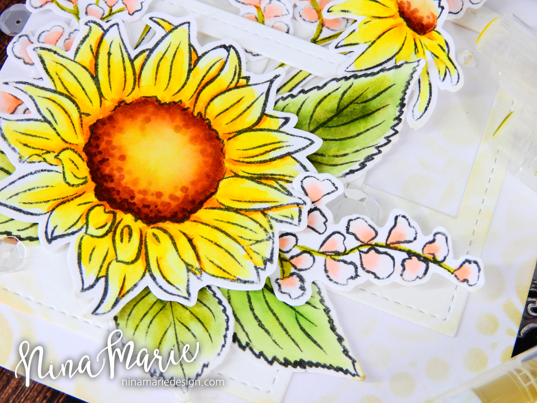
  Creating Floral Arrangements_4

This may seem like a lot of work and thought to put into a card, but remember you don't have to incorporate them all into your card all at once; I wanted to make sure they were each included in the design so I could best show you how they work together to create an overall appealing design. And trust me; the more you practice these design tips, the more you'll start doing them automatically. This is how I started; I had to remind myself of these things as I created a card, but now it's just part of the design process for me and I do it on "auto-pilot" so to speak! And I know that the more you practice these things, the more you will start doing them automatically too! 

Before I go, I'll quickly touch on the rest of the card process: 

I stamped the images onto watercolor paper with a waterproof ink and colored the images with Zig markers. I then went back in with a couple of Copic markers and added in a bit more extra detail. I layered the flowers and die cut frames onto my card base using liquid glue; I added the sentiment (heat embossed on dark brown cardstock in white embossing powder) using foam tape. The sequins were then tucked in and around the florals using some Glossy Accents. 

I hope this post has helped you learn some new tips and tricks on creating good layouts on your cards! Thanks for spending some time with me today, I will see you again next week! :)  

GIVEAWAY!

w&w_30giftcard

Before you go, I want to tell you that Shay was SUPER generous in allowing me to giveaway a $30 gift certificate to one of you, which can be used in the Winnie and Walter store! How cool is that?? BIG thank you to Shay for being so sweet!

To qualify for the giveaway, make sure you leave a comment on any of my Winnie and Walter blog posts (commenting on each Saturday post this month will count as extra chances to win the giveaway). After the last Leading Lady post at the end of the month, I'll draw a random winner from all the collective post comments.

PRODUCTS


Friday, August 19, 2016

Hello Friend with Lydia

Hello there everyone and a very happy Friday to you!

Lydia here with you and I have a one layer watercolour card to share using the beautiful In Bloom: Anna's Flora.

Winnie & Walter Anna's Floral Watercolour_1  

To start I stamped a cluster of flowers and leaves using Anna's Flora- I masked the flowers after stamping them so I wouldn't stamp over them, this also gives the look that the flowers and leaves are behind each other. I used VersaFine ink as when it is dry you are able to use water over the images without them bleeding. Once the ink was dry I added some colour to the images using Distress Ink- I used a couple of different colours of Distress Ink on the flowers and leaves to give a fun look while still leaving some white on the images. I look the carefree look this gives.

  Winnie & Walter Anna's Floral Watercolour_2

After colouring the images I still wanted to add some more colour in places, so instead of stamping more images and colouring them I added some splashes of colour using the same ink colours I used for the flowers. I then let this dry before adding the sentiment. For the sentiment I used The Big, The Bold and Happy- I love this sentiment set! I love large sentiments and especially ones you can 'build', I always find that a bold sentiment like this finishes a card off perfectly.

  Winnie & Walter Anna's Floral Watercolour_4

Thank you so much for stopping by and I do hope you feel inspired! See you again soon and have a beautiful day. 

Hugs, Lydia x

w&wDT_lydiaevans_blog-sig 2


w&w-supplies


Wednesday, August 17, 2016

Rerun No. 13 | Hugs On Your Day with Kelly

Hi Folks! Just a reminder that there's still a lot of time left in the Rerun Challenge using In Bloom: Lola's Bouquet with Joni Andaya (until the end of this month).


This card was so easy to make. Before stamping I lined up my ink pads from darkest to lightest. Then starting from the bottom, I stamped a row of solid flowers in my second darkest ink, with the outline and center stamped in my darkest ink. For the next row on top, I stamped the solid flowers in my third darkest ink, with the outline and center stamped in my second darkest ink. As I stamped up the card I kept using my lighter inks. For the sentiment I chose a contrasting blue to make it a fun, happy card. Keeping with the happy theme, yellow polka dots are on the inside.

I sure hope you get a chance to play with Lola's Bouquet this month and join our challenge!

Thanks for looking!
-Kelly


w&wDT_kellygriglione_blog-sig


w&w-supplies


Monday, August 15, 2016

Stencils & SVGs with Keren


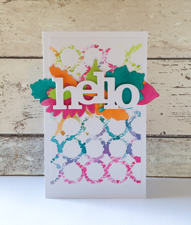
Hello! So glad to be with you today for a post combining stencils and SVGs!
IMG_6708
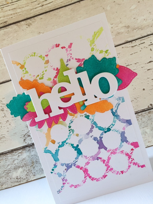
First off- the stencilled background. This is a popular technique and really simple to do. Grab a stencil; I used Pattern of The Ringsw_w_patternoftherings_cs_web_large
Choose some water soluble inks. Distress Inks work so well with this technique. I've used a really punchy combination, but you could go subtle if you'd rather.
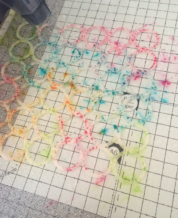
Pat the ink pads over the stencil. You might want something like a craft mat underneath as it gets a little messy!
IMG_6711
Don't worry about overlapping ink colours. It's worth starting with the lighter colours and moving to the darker colours after to avoid staining your ink pads. Once you've placed ink where you want it, give it a good spray with water.
IMG_6712
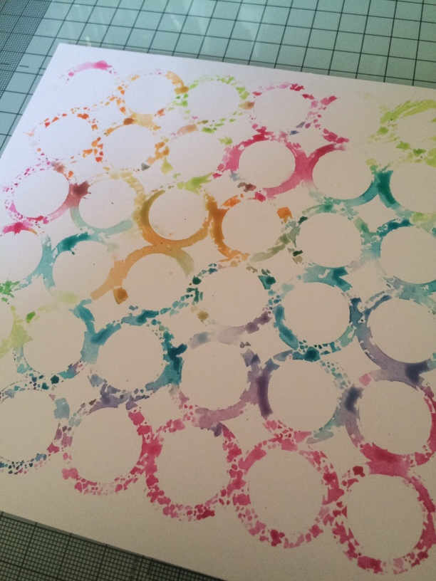
The more water you use, the more the colour will run. Once it's as wet as you want, lift the stencil up carefully and place ink down onto the card. You can simply add the cardstock on top of the stencil, but you can't then dab over it with a tissue to remove any excess ink, like I did here to keep the pattern as 'clean' as possible.
IMG_6713
You're left with a lovely pattern. If you work quickly, you can remove more ink before it dries or even spray more water to allow colours to develop. Then, just use as a background for your project.
IMG_6710
You can see from the picture, that there's actually no stamping!
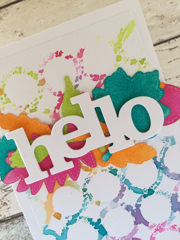
I've used the cut files from Winnie & Walter to create the leaves.
Download the files and arrange them to be cut out from your computer.
IMG_6714
I created some fun patterns after this arrangement that I'll use for a future project. The files are easy to use and really cost effective. Check them out here
IMG_6709
Once they were all cut out with my Silhouette Cameo, I added more distress ink matching the colours I'd used for the stencilled part and finished off my card with a In A Word: Hello Cutaway
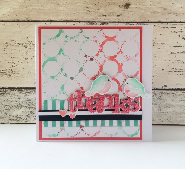
It doesn't need to be so 'in your face'. This is a perfect technique for using subtler gentler colours. See this card that I created using the same stencil but just 3 colours.
IMG_6687
I've used the In A word: Thanks Cutaway along with the LS Exclusives: So Tweet with Evelin T Designs stamp set. 
Truth be told, I didn't like the colour combo so much which is why I tried the brighter set which I ended up loving far more!
IMG_6686
Thanks for bearing with my lengthy post and I do hope you'll have a nosey at the Creative Screeenings (Stencils) & the Cut File collections.
See you soon
xx
w&wDT_kerenbaker_blog-sig2


w&w-supplies