Hello Folks! I'm super excited to share the projects I made in collaboration with Brutus Monroe!
The first project uses the most adorable snow globe stamp of Chicago that's actually on sale for only $4 right now!! Not from Chicago? You still may be in luck ... there are
7 other American cities available. As soon as I saw this I clicked on the order button because I thought it would be perfect for stamping on my envelopes. And it is! Unlike stamps for your cards, which you may only use a handful of times, a stamp like this for your envelope is fair game to be used all the time, just like a return address stamp. So you definitely get your money's worth.
I just wrote the return address around the curve of the globe. I used to collect stamps as a kid (because they were paper, after all ... I'm telling you, I've had a thing for paper all my life!) Unfortunately, most of the stamps are completely worthless, so I'm going to start adding some to my envelopes I think. Honestly, I've got thousands of them.
Now, let's find something to fill all those adorable envelopes I'm going to have on hand!
Did you know that Ken Oliver partnered with Brutus Monroe to release a set of Color Burst watercolor medium? I was so excited to see this! Two years ago at Creativeation I was fortunate to spend some time with Ken watching him demonstrate the Color Burst. It's truly amazing! In case you haven't heard of Color Burst before, it's a powder that contains concentrated amounts of color. Water releases the color, so if you tap some flecks of powder on your watercolor paper, and then spritz them with water, the color LITERALLY BURSTS across your paper. You have to see this for yourself. It's really amazing. Anyway, I never got around to playing with these two years ago, so I was very excited for the opportunity during this Winnie & Walter and Brutus Monroe collaboration.
Let's take a look!
This was the first watercolor panel I played around with. I made the entire surface damp and then sprinkled several bits of Jack O Lantern powder all over. I sprayed it again with water several times until the color spread pretty evenly and I was left with a mostly solid orange piece of paper. Not terribly exciting. So I sprayed it again with water and added the Marsala to get some deep spots of color. It's so neat how you can just keep adding water and color until you're satisfied.
With these colors, a Halloween card was just begging to be made, so I got out the Winnie & Walter
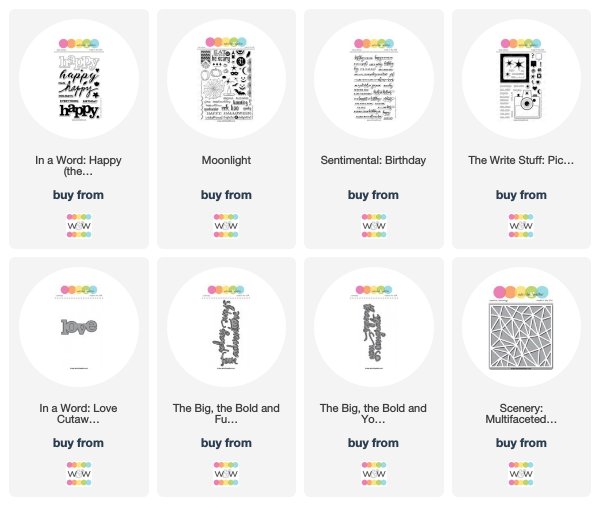
Moonlight set and stamped some bats flying around, as well as the pumpkin witch and sentiment. Boy did it feel good to not have any rules and just play around with the colors!
I started this card out with the Marsala because I feel in love with its deep hue. To spice it up I added some Cabbage powder and sprayed it with water to get the "burst." It's interesting that this green color has so many other colors mixed in ... you can see bits of red, aqua, and yellow along with the green. That's perfectly OK for this exercise, I was just a little surprised. In the end it turned out looking (to me, very loosely) like leaves on a tree, with the purple sunset in the background.

Once the background is done, I go shopping in my binder of extra die cuts from prior projects that I didn't throw away, BECAUSE I MIGHT NEED IT SOMEDAY. Well, someday has come, and I'm enjoying shopping through all the available bits and pieces. I found a "love" die cut from
In a Word: Love Coordinating Cutaways that happened to be covered with burlap! Ooooh, that texture!! And with all that texture, a metallic gold "you" from
The Big The Bold and You Cutaways is the perfect counterpoint to adhere on top.
After all of that imagining seeing a tree in the last card, I thought why not try and make a tree! I made a green and blue background and dried the card. Then another layer of green for the leafy area, and then dry the card. Finally, one last layer of Jack O Lantern to make a trunk.
Not bad! Not sure if you saw, but this month we are highlighting stamps in the
The Write Stuff: Picture Perfect set for the Rerun feature (there's still a week left to participate!) This camera is really one of my favorites! I cut the middle of the camera body out to make it easier to see what patterned paper would be nice to add there, and settled on this starburst feature. The "adventure" sentiment is from
The Big, the Bold and Fun Cutaways.
Oh my, this is totally one of my favorites, perhaps all year! I swear I needed sunglasses while working on it : ) The intensity and brightness of these colors is just amazing. This watercolor panel started out wet and I just added powder, re-wet it, added powder, re-wet it, etc.
The "happy" die cut sentiment is from
In a Word Happy Cutaways. I threaded a gold embossed "happy birthday" from
Sentimental: Birthday through the cursive font of the die cut. I love staring at these inked creations to see if you can find something that stands out. To me, I see pansies with those tiny yellow centers on the card.
My final card is a take on the classic rainbow melting crayons art work. I sprayed the top portion of the card with water and sprinkled a few bits of powder on that area in rainbow order. A couple more sprays of water to get the color really nice and moveable, and then I tilted the watercolor panel up so the color would drip down.
A "congrats" from
The Big The Bold and You Cutaways is all I needed to finish the card. Oh WAIT, we haven't talked about the
bottle cap sequins!!! These were a fun discovery! There's a whole section of these at Brutus Monroe. They have crimped ridges on the ends, but are nice and flat so you can adhere them to your cards.
What a fun time this was, playing around with the Color Burst! I'm kicking myself for not doing this two years ago after I got home from Creativation. It seemed like a big deal to figure out how to use them. But nope, not much to figure out. All you do is sprinkle the powder, and spray with water!
Thanks so much for stopping by! Let me know if you end up playing with the Color Bursts!
- Kelly
Note: Don't forget to enter to win a $25.00 Brutus Monroe gift card HERE and check out the Brutus Monroe blog for more extraordinary inspiration!