Wednesday, September 30, 2015

Metallic | I Heart You with Lydia Evans

DSC06278v

Hi there, it's Lydia here with you again on the Winnie & Walter ! I'm so excited to be sharing another video with you again today! Again as this months theme is 'Metallic' I wanted to share with you another technique to put some metallic shine into your crafty makes. This time I have focused on craft metal and how you can hand emboss stamped images to create a super 3D effect.

  DSC06278

I have used the heart shaped gem from 'My Precious' and stamped on the back of the craft metal and embossed it from behind to get the heart to really pop! I love the way that the heart jewels catch the light in all different ways, so fun.

  DSC06280

The sentiment is from 'True' and I just think it is so fun to match with those pretty embossed 3D hearts.

  DSC06282

Here's the video on how I created this card....


Here's a direct link:

https://www.youtube.com/watch?v=cBHCyfbKesY

I really hope you enjoyed the video and like my card!

I'll see you again soon!

Hugs, Lydia x

w&wDT_lydiaevans_blog-sig


w&w-supplies


Tuesday, September 29, 2015

Spotlight on Lisa Lahiff...Part Deux!!

spotlight-lisa-lahiff

We are so happy to have Lisa Lahiff back with us for another stupendous post with an emphasis on the metallic!  If you missed learning more about Lisa and seeing her first post full of beautiful and innovative metallic projects CLICK HERE!


Now, it's Lisa's time to sparkle and shine...  


Hello!  It is Lisa back here with you today, and I am so thrilled to have one more day to share some metallic awesomeness with some amazing Winnie and Walter goodies!!!!  Let's dig in...


For this first card I had a lot of fun layering up various patterned papers by My Minds Eye for a bright and eclectic background.  I then went ahead and ran my In a Word Happy cutaway through my machine three times with three different foiled papers.  I love not only the thickness, but by stacking them up slightly to the side of each other, you are able to see all three colors.  I then diecutted the tag from the Essentials:Audrey Cutaways, and stamped the birthday sentiment from The Big the Bold and the Happy Stamp Set.  I finished my card off with some twine tied at the top of the tag, faux stitching down the side of the card and some sequins that came with my Winnie and Walter happy mail!


This next card was created using The Big, the Bold, and the Merry Creative Screenings. I wanted to create a metallic background for my sentiment to really pop in the shaker frame so I started by using reposition-able adhesive on the backs of the "merry" and "christmas" creative screens.  I then used a gold metallic ink and applied it to the entire background with a blending tool.  I carefully removed my screens and had a nice negative of my sentiment.  Next I used the  Essentials:Audrey Cutaways to create my frame with patterned paper, adding various sequins including 4 mm Metallic Gold Cupped Sequins, and 6 mm Sparkling Clear Sequins by Pretty Pink Posh which can be found in the Winnie and Walter Boutique to create my shaker element!  I added a sparkly paper bow to the corner as a finishing touch.


I am so excited to show you this last card as it has a lot of firsts for me on it!  For one the background was diecut with household aluminum foil, which was so fun to try! (Warning make sure you pull the die cut out gently as the foil is very fragile and thin to work with.)  Then I was trying to think of what else I could do with this cut, and how to add some color when embossing popped into my mind.  So that's what I did!  Using the In Bloom: Lola's Bouquet with Joni Andaya Stamp set and a watermark ink pad I embossed and double embossed various images for a fun floral design.  I then stamped and embossing my "hello" sentiment from The Big the Bold and the Happy Stamp Set.  Finally, I propped it up with foam adhesive onto a panel of vellum with foil before adding it to my cardbase.  I wish you could see the beauty of this card in person, the shine of the aluminum and the layers of embossing are just gorgeous!  Anywho, I hope I was able to capture just a little of its beauty for you to envision the real look of it!

I want to end my post with a warm and most sincere thank you to both Shay and Julie for shining the spotlight on me.  I have had an amazing time just playing and having fun with lots of Winnie and Walter products, and I know I will continue to do so for a long time to come.  You both are so welcoming, warm, and encouraging that you make the crafting community a better place.  Many hugs for you both!  I must also thank Winnie and Walter for letting me come on this blog to play!  And finally a heartfelt thank you to you for stopping by and visiting my work, your kind words have been so motivating and appreciated.

Happy Crafting!
Lisa

Monday, September 28, 2015

In Focus with Gayatri Murali No. 5 | Style #2

Hello and welcome back to September In Focus tutorial. This is Gayatri Murali.

in-focus-banner-title_640px

Keeping with this month’s theme of Metallics, I am focusing on the Gold Trend.

The-Gold-Trend-technique


Gold is trendy and hot at the moment. But gold has been traditional for holiday and Christmas cards. Gold brings instant festivity to the occasion. So in keeping with the tradition, I am sharing with you another way of adding gold to your projects.

Gayatri Style banner copy

In this tutorial, I am sharing with you the gold foiling technique on stamped images.

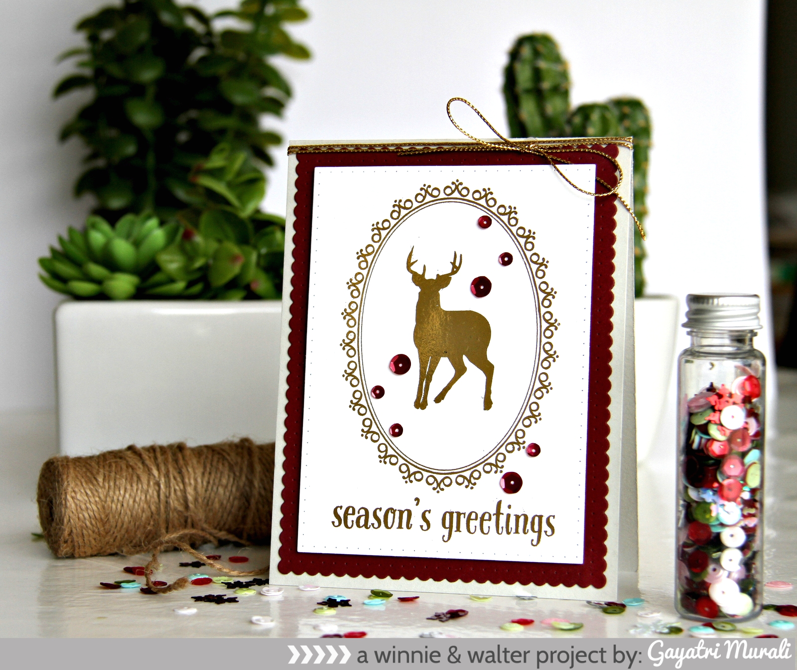
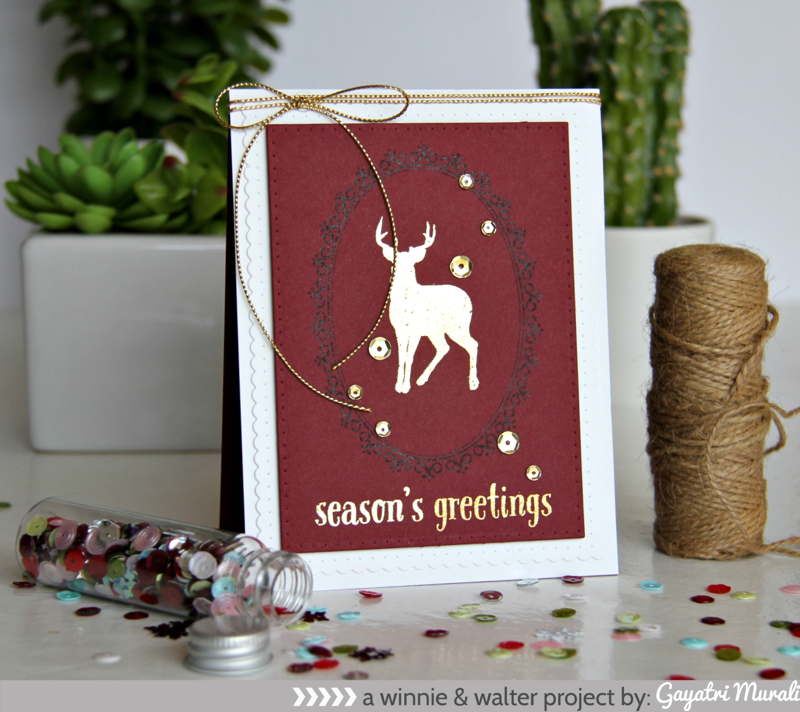
I have couple of finished cards here. The first card shows gold foiling on white cardstock and the second shows on coloured cardstock. Just some variations.


Season's Greeting card

Season's Greetings Foiling on coloured cardstock

photo-tutorial_banner

tutorial collage

brief_banner

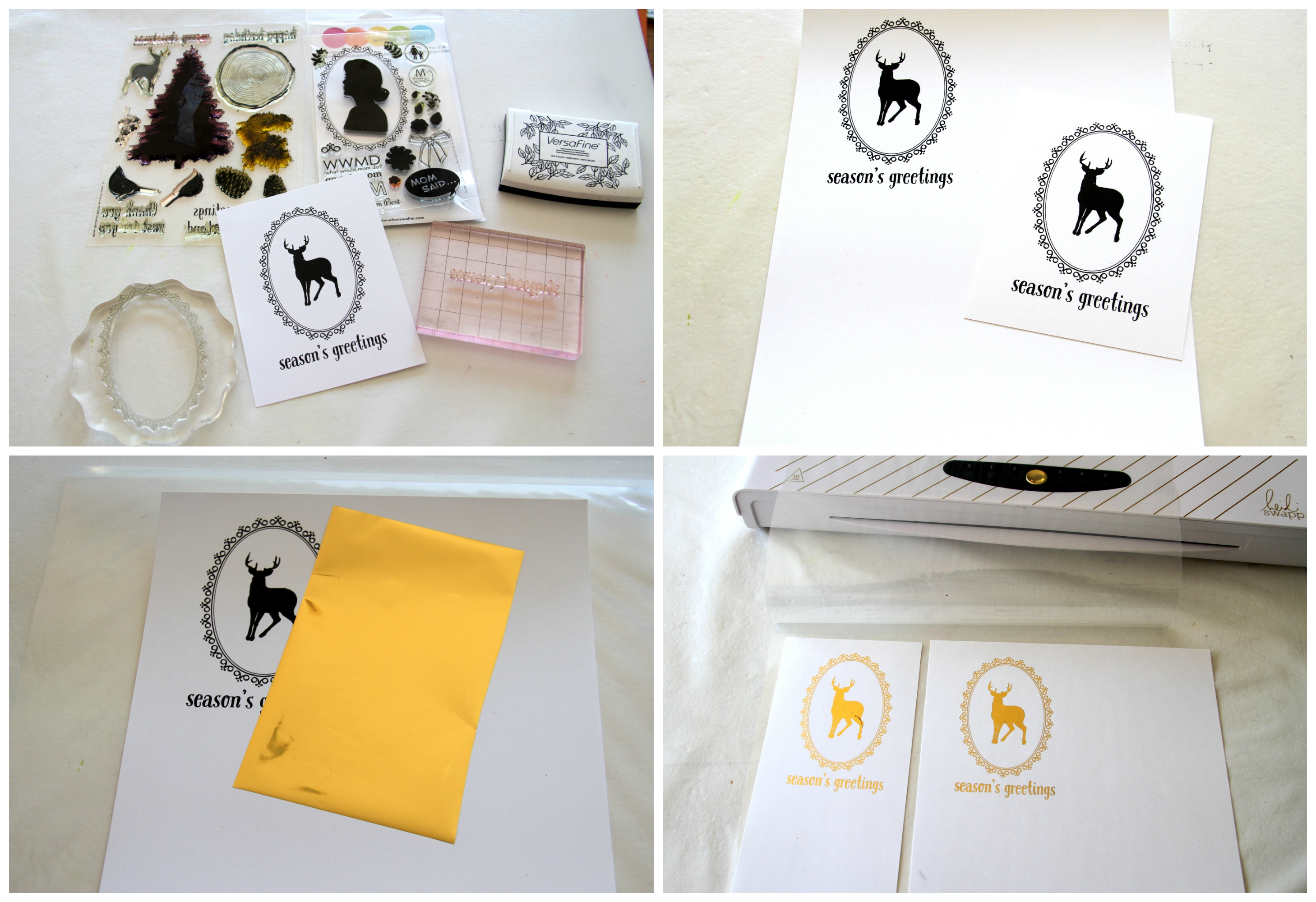
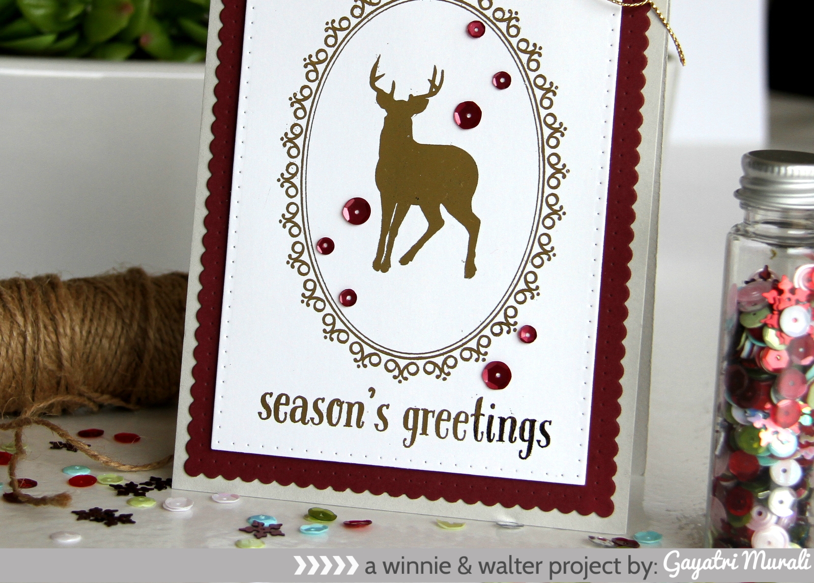
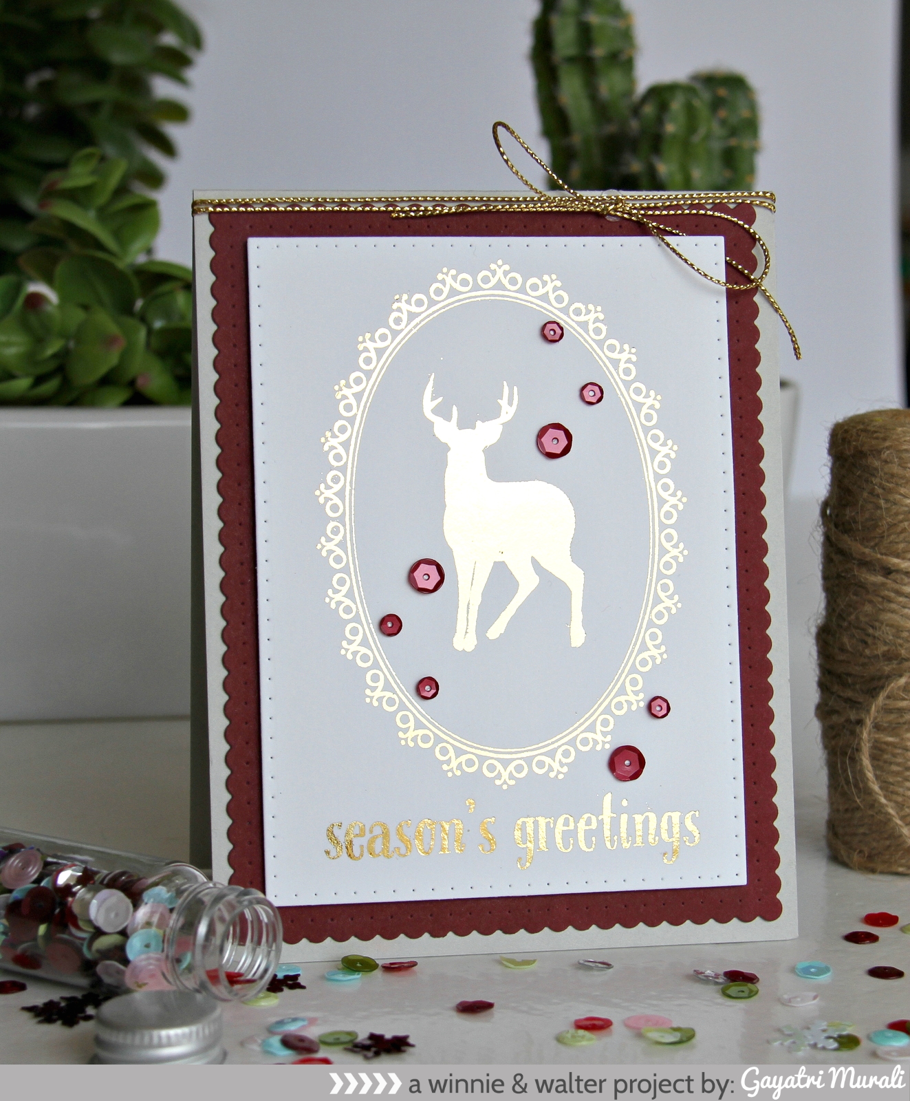
I started with stamping the reindeer in black from Winter Woodland stamp on the centre of white cardstock panel trimmed to card front size. Then the frame from The Write Stuff: Leave it to Mom stamp set to frame reindeer and the sentiment from Winter Woodland. I used Versafine Black ink as it is a pigment ink and gives nice coverage on detailed images.

Next I scanned and copied this panel on an 80-pound Neenah cardstock using my laser printer. Make sure the flatbed scanner is clean of any dust. Otherwise the dust will be picked on the copied cardstock and foil will stick to it. If you are mass producing this card, just copy multiple times on the cardstock using the settings on your scanner printer. Since this is my first time, I just copied once. So I trimmed the copied cardstock to the size of the card front.

Now, I am using a Minc machine to foil the images. I set my setting to three and foiled the images using gold foil paper. I ran it twice just to make sure the details on the frame picked up the foil. With the white cardstock, the foiled images came out smooth and lovely. There were a few spray dots which was not noticeable. I believe the dots were the dust from my scanner bed. You can see my photo above, the left foiled panel has a scratch on the reindeer but then when I scanned my second time, wiped my flatbed off dust, then darkened x2 on my settings to get a nice dark image. That image when foiled came out perfect. Loved it.

Season's Greetings closeup


On this angled photo below you can see the gold foil better.

Season's greeting card #1 angle

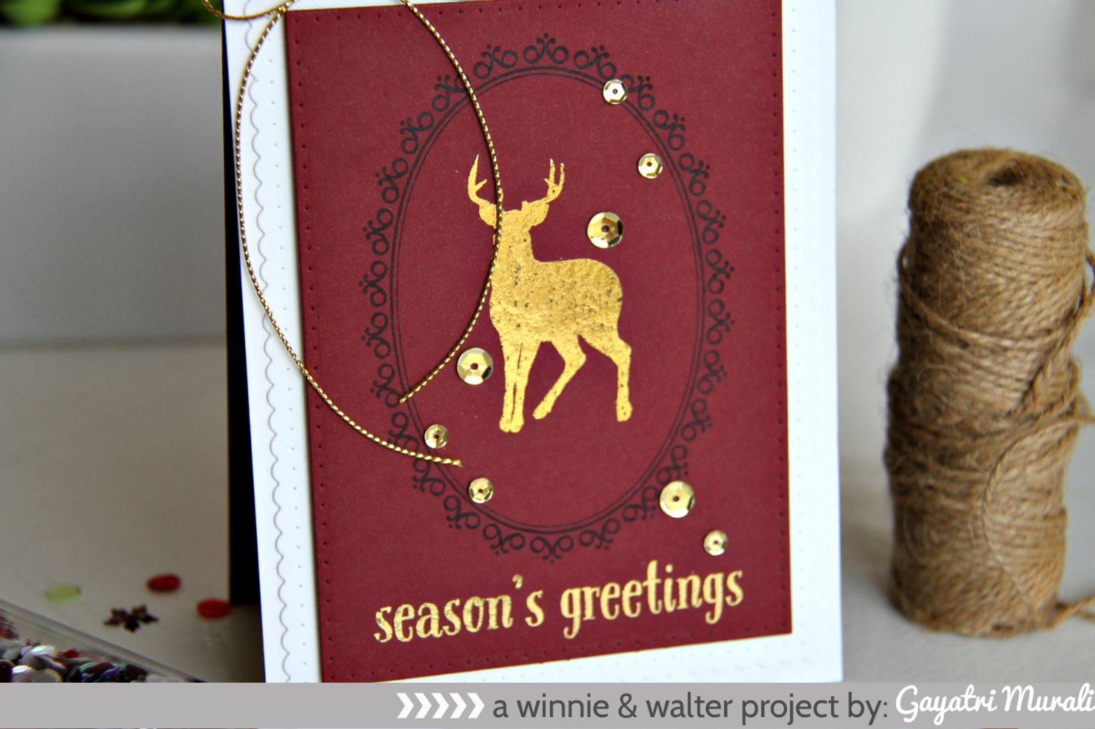
Then I wanted to see how this works on coloured cardstock. So I copied the image on a dark coloured cardstock and foiled only the reindeer and sentiment. The image was not as smooth as on white cardstock. This one has streaks. It does not look like a mistake but looks like distressed. You know what I mean. It is cool. But the sentiment came out smooth though.

Season's Greeting closeup1

I then used Essentials: Katherine cutaway to die cut panels out of the foiled panels, then using Essentials: Audrey cutaway to die cut the layering panels. I kept the card simple by layering the panels, adhering on the card front, then using gold twine to tie and add bows on top of the card. Finally embellishing with Cranberry sequins from Pretty Pink Posh on the white and gold sequins on the coloured.

Tips:

If you don’t have a laser printer, get your stamped images laser printed at any stationary store. In Australia, Officeworks does it on cardstocks. They do have thicker cardstocks so you do not have to take yours in. If you don’t have Minc machine yet, run it through a laminator to foil. Play around your settings to find what works well.

The foiling technique takes stamping to another new level. It is so much fun. Hope you are inspired to give this technique a try. Enjoy foiling!

Thanks for stopping by!

w&wDT_gayatrimurali_blog-sig

>>>LINK UP<<<


w&w-supplies

Saturday, September 26, 2015

September Leading Lady Lindsay Amrhein | Take Four

As September wanes we reach the last Saturday with our amazing September Leading Lady, Lindsay Amrhein.  These four weeks with Lindsay have been delightful and have passed all too quickly.  We wish to express our heartfelt gratitude to you, Lindsay, for the incredible inspiration and excellence delivered with each of your performances.  It has been a true honor to have you as our leading lady.  

If you missed her smashing debut you must see it...CLICK HERE or her second performance which showcases her wonderful watercoloring CLICK HERE or ink blending skills gloriously displayed in her third performance CLICK HERE!

Lucky for us all we have her final command performance today.  

Hello!

I am sharing my final cards on the Winnie & Walter blog today, and I think I might have shed a tear, sniff..I am humbled, and grateful for all of your lovely and very kind comments about my projects. You sure know how to make a girl smile! I have had a blast making cards with these amazing products! 
For this post, I went with a great technique that I absolutely love, which is Masking! I remember seeing this technique in an old Paper Crafts magazine when I first started card making, and it intrigued me! To be able to create depth with stamps and ink is such a fun concept, so, let me show you what I did.
I focused on Sympathy cards today, using The Big, the Bold, and Comfort stamp set for both. I started by stamping one of the large blooms from In Bloom: Lola's Bouquet with Joni Andaya, using pink and red ink. I then stamped it again onto a piece of masking paper and trimmed out the mask, adhering it over top of the large flower. I then stamped the vase, so that it looks like it is behind the flower. So, whatever image you want to be prominent needs to be stamped first. I did this with three more of the flowers, as well as the leaves (to which I did a bit of rock n' rolling). I should note that I took a bit of pink ink, and watered it down to flick onto the card front, as well as blended in some ink at the top with a sponge before I started stamping!
Die cutting the coordinating die, Prayers, I ran it through multiple times with white card stock, and once in black. I then adhered them all togethers, and placed it where I wanted it on my card front. I then inked up the other part of the sentiment, removed my die cut, and stamped. The vase was previously colored with light blue Copic markers before adhering the die cut down.
The next card is a bit more complicated. I began to stamp and mask the flower from In Bloom: Addie's Garden multiple times across the bottom of a piece of watercolor cardstock. I then took a couple of Distress Inks in Spun Sugar, and Dried Marigold, and created a wash over my heat embossed flowers. This created a resist. Taking the Essentials: Audrey's Cutaways on my Water color cardstock, I ran it through to give my panel a bit more interest, before working on the sentiment.
I used the coordinating dies for this as well, and die cut Sympathy multiple times with white cardstock, adhering them together with liquid glue. I then applied a bit of Spun Sugar to it. I placed it where I wanted it to go, and stamped the rest of my sentiment around it, before adhering it down. 
In hindsight, I likely wouldn't have gone with such happy colors for a sympathy card. But, the thought is what counts right? :)

How about an encore? I couldn't stop creating, and this poor card got left out! So, I thought I would share it anyway. 
I used a piece of watercolor cardstock, and using a piece of acetate, did a bit of ink smooshing. If you aren't familiar, I did a video of it awhile back, here. When it was all dry, I adhered it to a card base, and worked on adhering all of the smiles die cuts to it.
I stamped part of the sentiment from The Big, the Bold, and Comfort, in gray above the layered smile die cut, and added a banner with the rest of the sentiment, heat embossed on gray cardstock. I finished it off with a few black enamel dots. 

There you have it! I really hope you have been inspired to try some of these techniques! I have thoroughly enjoyed being with you all! Thank you, too, to Julie and Shay for having me along this month, it was a blast! 

Oh, and be sure to stop over at my blog for a generous Winnie & Walter giveaway! Have a great day!


w&w-supplies


Friday, September 25, 2015

Fall Coffee Lovers Blog Hop

Fall Coffee Lovers Blog Hop


Happy Friday lovelies!  We are sponsoring and participating in the Fall Coffee Lovers Bloghop organized by our friends at Coffee Loving Cardmakers.

This is a perfect time to get your coffee on as National Coffee Day is September 29, 2015.

Of course lovers of all hot beverages like tea and cocoa are also welcome!

To find out more about joining in or just to enjoy the blog hop please CLICK HERE.  There are tons of awesome sponsors and prizes!

Now let's see what Julie has brewed up. :-)

Julie


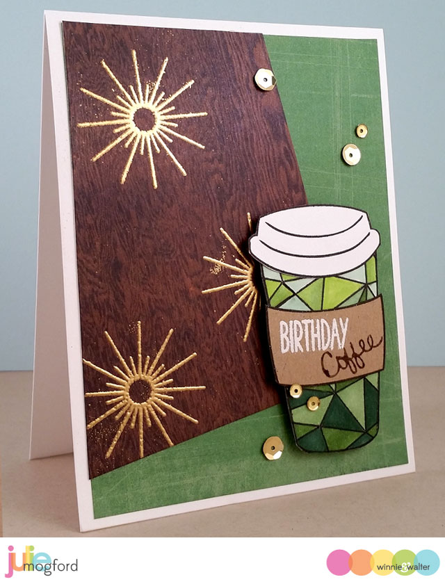
My coffee card is actually a belated birthday card for my sister.  I know - I’m so bad about getting my cards out in a timely fashion.  I wasn’t sure what kind of card I wanted to make for her, but let me tell you something, Mandy loves her coffee!!!  This is my tribute to her and to Starbucks.

jmog_coffee-hop_mandy-bday

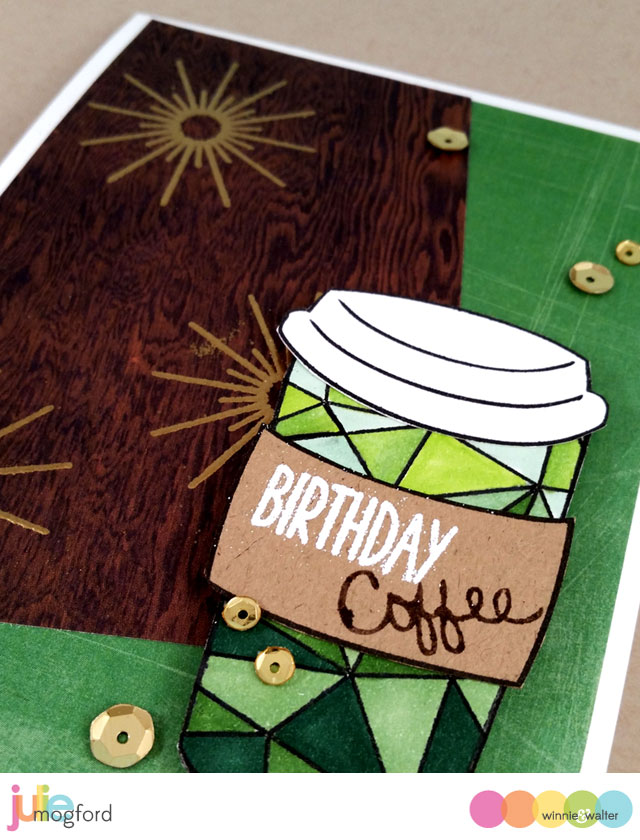
My coffee cup stamp is actually from two stamp sets I designed for Paper Wings Productions a few years ago. The cup, lid, coffee sleeve and the word coffee (stamp written in my handwriting) were the perfect items for this card. I used the Mini Scenery: Multifaceted stamp as the design for the cup.  To me, it looked like just the right design I might find on a personal cup at Starbucks.  I colored it with a variety of Copic Markers (YG03, YG25, G24, YG67 and G29).  The sleeve is stamped and cut from kraft cardstock with birthday stamped from Sugar Rush and embossed white, with Coffee stamped using a Chocolate Chip marker from Stampin’ Up!.  

jmog_coffee-hop_mandy-bday2


Using some Studio Calico papers I received as a gift from Shay, I found the perfect shade of distressed green paper and a dark woodgrain paper to add for interest.  Then I thought it needed a little something more, and thought the large sparkler from Sparkle embossed in gold would give it a nice retro / hipster feel.  I added a few gold sequins from Pretty Pink Posh to carry the gold to the other side of the card.  


I hope you enjoy your coffee and hop today!  Now, I need to get to a Starbucks…….

w&w_julie_blog-sig


w&w-supplies