Our our November Leading Lady Alice Wertz is back for her triumphant third performance! If you missed her smashing debut you must see it...CLICK HERE or her sensational second performance with a lovely colorful impact CLICK HERE. Today's card is incredibly dynamic and so worth the effort!
Without further ado, Alice....
Hello, all! =) Here is my card for this week's Leading Lady post.
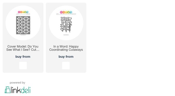
This week I decided to play with the Cover Model: Do You See What I See? Cutaway. I used cardstock in Winnie & Walter colors and used the negatives of the die cut for a colorful background. Once again, I used a cutout of the frame as my guide when I glue those little shapes with foam tape.
For a colorful background like this, a dark sentiment would stand out best, so I used one of the happy words from the In a Word: Happy Coordinating Cutaways and shimmery cardstock for the first part of the sentiment. Since stamping on the background would be challenging, I used my Dymo label maker to create the second half of the sentiment.
Again, this one took some time to make, but I found it therapeutic doing it while watching or listening to my favorite TV or podcasts. Hope you likey! =)
Thanks so much for stopping by!
hugs,
alice
supplise:
cardstock: (white, Harvest Gold, Limeade Ice, Hibiscus Burst, Orange Zest, Aqua Mist, Onyx Shimmer) Papertrey Ink
accents: (Kaleidoscope, Cosmopolitan sequins) Lucy's Cards, (label maker) Dymo
dies: (Cover Model: Do You See What I See? Cutaway, In a Word: Happy Coordinating Cutaways) Winnie & Walter
tool: (die-cut machine) Provo Craft
other: (foam tape) 3M
card size: 3 5/8" x 5 3/8"


Another fabulous card! Love it!!!
ReplyDeleteLove the dimension and color combo!
ReplyDeleteLove the way you used this die cover.. lovely card
ReplyDeleteSuper fun card--love that you used the W&W colors!
ReplyDeleteBeautiful colors and dimension. I appreciate all the work you put into that.
ReplyDeleteWow! This intricate and unique design is so impressive and beautiful. Love how you used the negative die pieces!
ReplyDeletelove the attention to detail:)
ReplyDeleteFabulous card! Love the contrast of the black words (and label)) with the brightly colored background. That looks like a lot of work, but the results are stunning!!
ReplyDelete<3 J
jwoolbright at gmail dot com
HerPeacefulGarden.blogspot.com
Love the colorful background you created.
ReplyDeleteWhat an amazing card with a real retro vibe!! Love it!
ReplyDeleteThis background is amazing!
ReplyDeleteYour creation is really awesome!
ReplyDeleteGr8 use of negative dies with such dimensions, love it!
ReplyDeleteLooks fabulous and
ReplyDeleteit's a wonderful way
to use the cut outs!
Carla from Utah
That's a great graphic card !
ReplyDeleteThis is an absolutely amazing card! Love the colours!
ReplyDelete